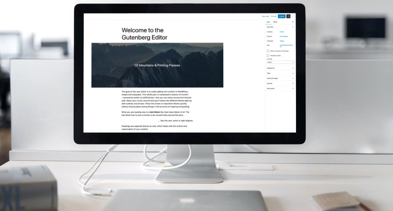
The WordPress block editor is officially four years old.
Well, technically the Gutenberg project is older than that, but the block editor as we know it was rolled into WordPress core with WordPress 5.0 back in January 2019.
Still the WordPress block editor can feel like this mystical place almost for a number of users. While newer users to WordPress might find it pretty easy to use since they know nothing of the older, classic editor before it, seasoned WordPress users seemed to struggle more with using the newer block editor.
So if you’ve wanted to take a deeper dive into the block editor from a user’s perspective, you’ve come to the right place.
In this post, we’re going to take a look at the block editor, what blocks are and how you can add and edit them and take a look at block patterns.
This post will not cover the site editor, which, while similar to the block editor, has a different function and is something I’ll talk about in an upcoming post.
So let’s dive right into the WordPress block editor.
Table of Contents
- High level overview of the WordPress block editor
- What are blocks?
- Adding blocks to your post or page
- Editing how blocks look in your content
- Most common blocks you’ll use on your website
- How to add blocks to your website
- What are block patterns?
- What are reusable blocks?
- Upgrade your block editor experience with the Crosswinds Framework
High level overview of the WordPress block editor
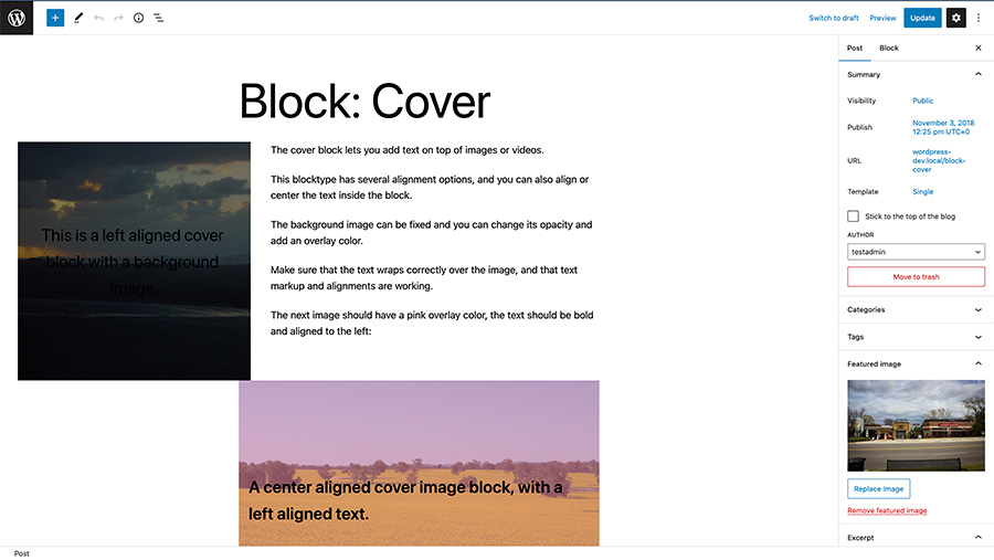
So the WordPress block editor started out as the Gutenberg editor/plugin back in 2018. And really it’s phase one of the Gutenberg project, which aims to include site editing (almost complete), collaboration and built-in multilingual support.
The goal of creating the new block editor was to change the post and page editor to create a more WYSIWYG (what you see is what you get) experience for users, like Wix and Squarespace, as well as various page builders.
Technically, the old editor was called the WYSIWYG editor, but there were challenges when trying to actually show shortcodes or creating layouts with columns and other neat layout tools.
That actually led to the rise of page builder plugins like Beaver Builder and Elementor. The downside to that is that compatibility between page builders was always a challenge, and going from a page builder back to a default regular theme meant cleaning up a bunch of shortcodes.
So the hope was that the block editor would standardize the page building experience, which it may or may not have done depending on who you talk to.
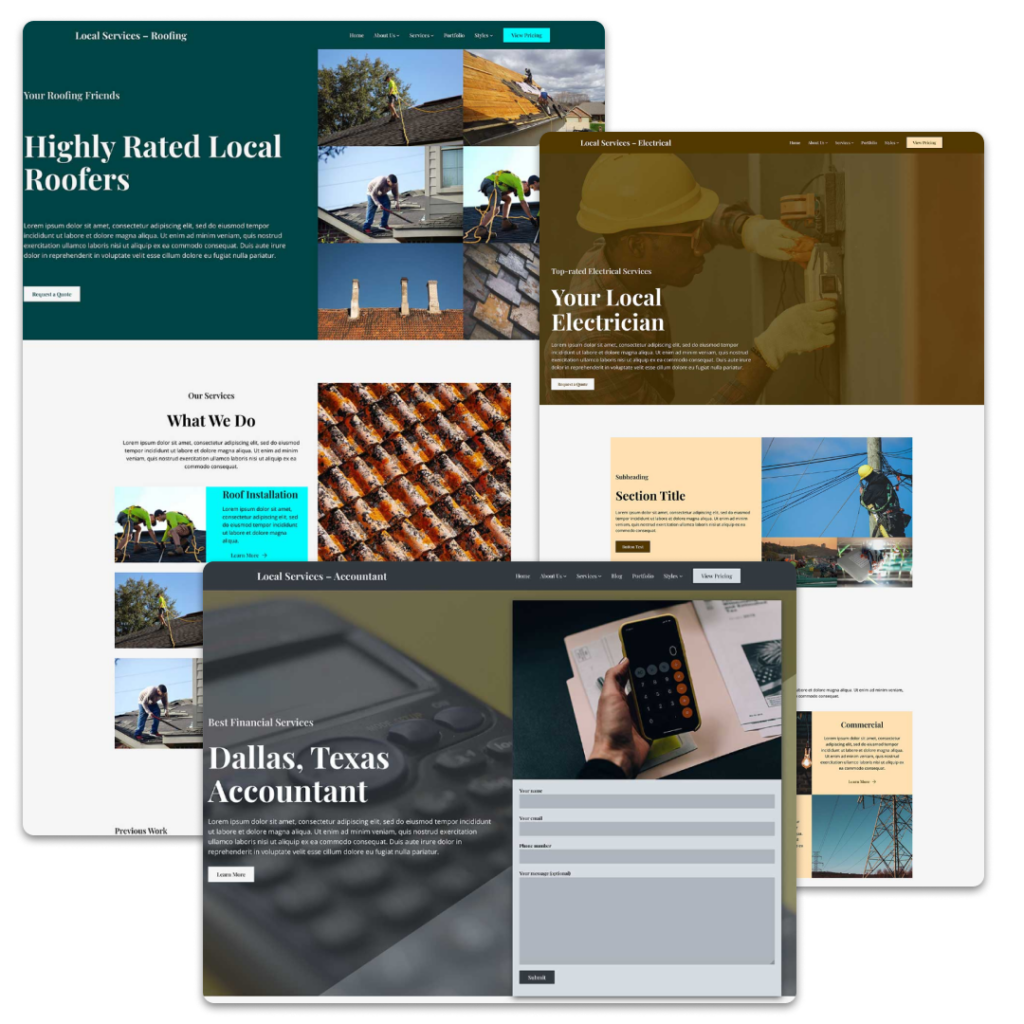
For example, you can now create a custom landing page for a service complete with a hero section, a column for features, even a pricing table and more right in the editor without needing to touch any code.
The Gutenberg project has now moved onto phase two with the full site editor and is pushing on to phase three and four, which are collaboration and multilingual. But it all started with phase one and the block editor.
What are blocks?
Blocks are essentially sections of content or even code. And they can be added to the page and view visually right in the editor.
In a way they are a lot like shortcodes, especially the more complex and custom ones. In fact, for the handful of plugins I created before the block editor, I was able to easily turn those shortcodes into blocks.
But basically everything is now a block. The paragraph you’re reading right now is a block. The heading for this section is a block. And the list goes on.
Blocks can be moved around and certain blocks allow you to add blocks inside of them, which gives the user more control than what they had with the old editor.
And there are blocks for just about anything. From text to images to embeds to a cover block to blocks that allow you to do cool formatting and layouts.
Plus, you can create your own blocks if you know what you’re doing (but that’s outside the scope of this blog post).
Simply put, blocks are now the tools you can use to create cool pages without having to write any code.
Adding blocks to your post or page
Adding blocks to your content is really pretty easy. In fact, just hitting enter when you’re writing in the editor creates a paragraph block.
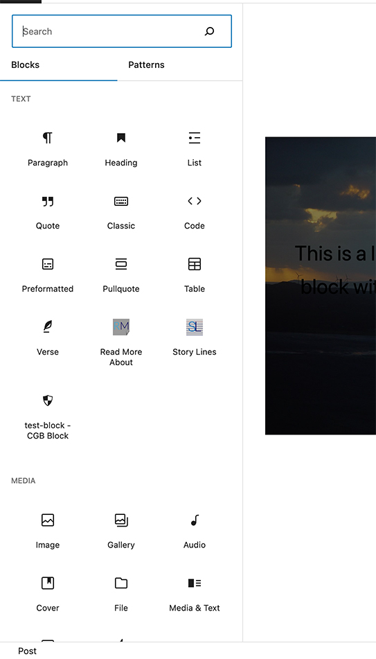
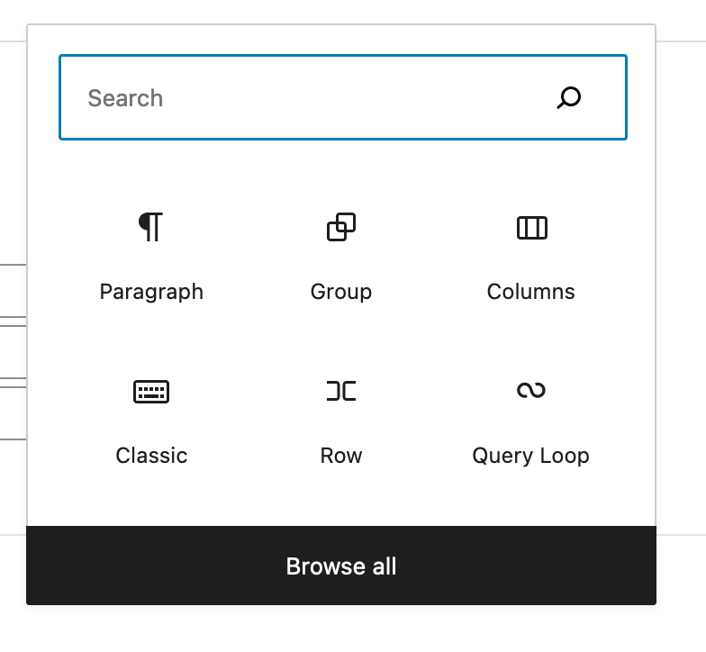
When you create a new paragraph, there should be a button with a plus icon nearby that can open up the block inserter. This inserter will suggest a couple of different blocks, but you can hit the view all button to see all of the blocks and block patterns.
Alternatively, you can hit the button with the plus icon in the top left part of the screen to open up the block inserter.
Finally, if you already know the name of the block that you want to add, you can create a new paragraph, type the backslash key and then type the name of the block. A dropdown will appear where you can add in the block you want.
Once the block is added, you can start to edit it to meet whatever needs you have for that block. But do note how you edit a block really depends on that block. If you have any questions about how to edit a third-party block, you’ll need to refer to their documentation to figure it out.
Editing how blocks look in your content
Once you add in a block to your content, there are a few different areas where you can edit that block that you will see when you select the block.
Toolbar
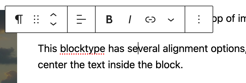
The first area you’ll see where you can edit a block is the toolbar.
This is where you can align the block, transform the block into another type of block, move the block to another part of your post and page and navigate to the parent block, if the block is inside of another block.
Also, some blocks will have extra options in the toolbar you can use to edit the block. For example, the paragraph block will have options to bold and italicize the text, create a link in the text, format a section to look like inline code and more. And the image block will have options to replace the image and crop the image among other options.
By default, the toolbar appears right above your selected block, but you can change an option in the block editor options (the three vertical dots in the top right corner of the editor) to pin the toolbar to the top of the page so that it’s out of the way of your content.
Inspector

The most versatile section where you can edit a block is the inspector column.
This is the area in the right sidebar where there are a lot of options for almost every block. If you don’t see these options, make sure you have the right sidebar visible and that you have the “block” tab selected.
Here you’ll find color options and appearance options (such as font weight and size, line height and letter case) for just about every block.
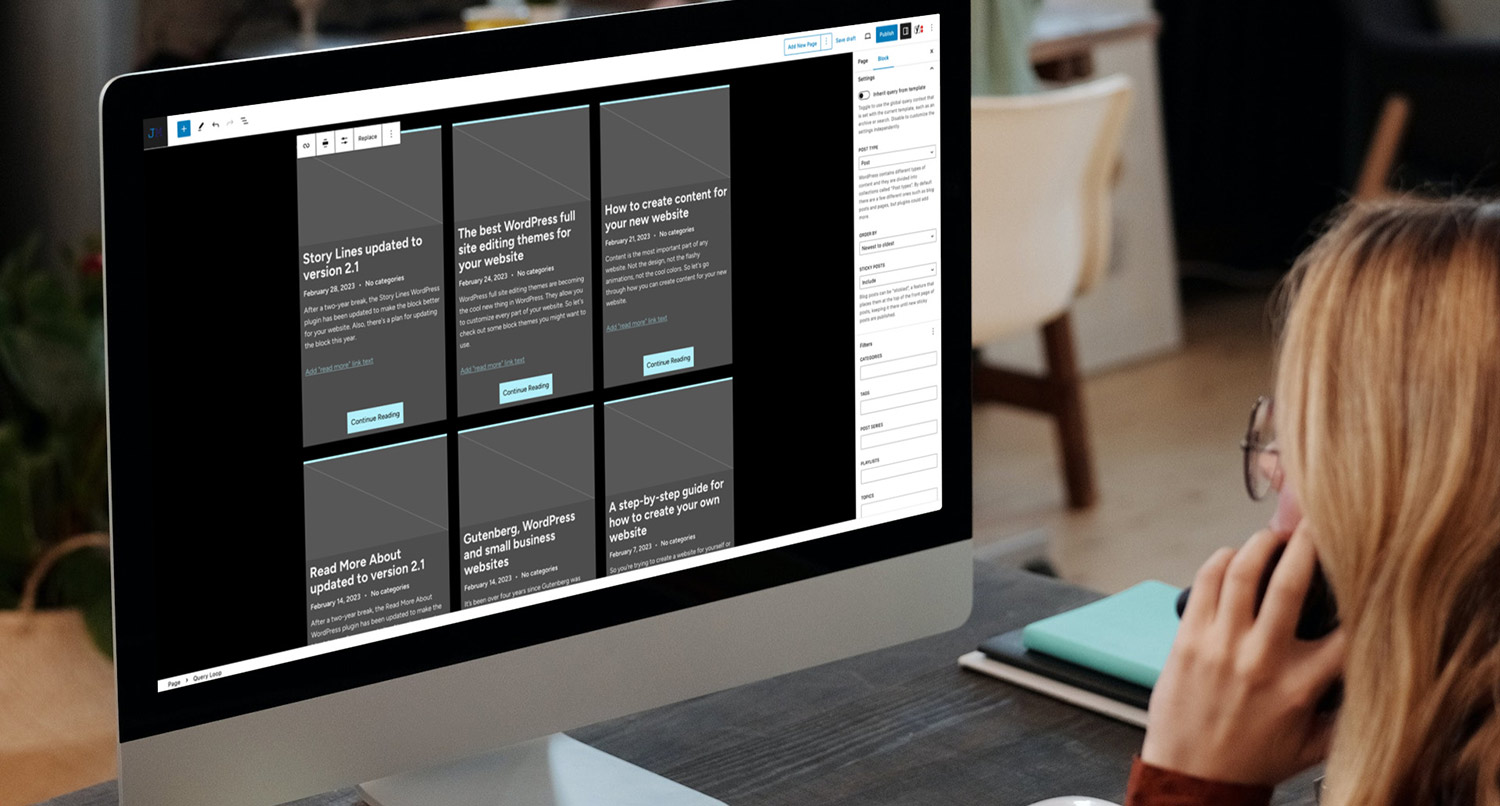
But you’ll also find a bunch of other settings for various other blocks here as well. For example, the query block will have a bunch of filtering options in the inspector. Plus, custom block developers will put a bunch of their block options here as well.
So you’ll be using this section a lot, and it’s worth taking the time to familiarize yourself with the inspector controls.
Block styles
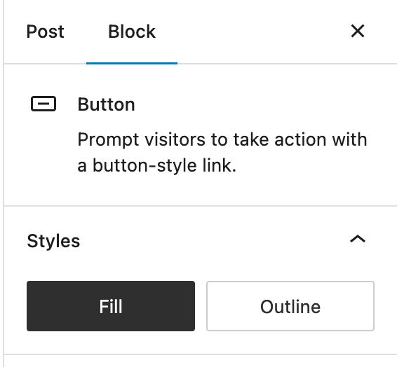
Finally, some blocks even come with their own block styles.
Block styles essentially change how certain parts of a block look. For example, with the Portafoglio theme, I created a block style for rounded edges, two drop shadows of a certain color and corner borders.
If a block has registered block styles, you can see them in the inspector column. And it’s easy to switch between block styles and reset to the default style, so you can play around with how a block looks on your page.
Block styles are a bit overlooked at the moment, but depending on the theme you’re using, they might make a pretty big difference for your blocks.
Most common blocks you’ll use on your website
While you can add in any number of different blocks, let’s take a dive into the most common blocks you’ll use on your website.
Heading

The heading block allows you to create a heading in the content. You can add in a level one heading all the way down to a level six heading.
While it seems simple enough to add a heading, you do need to be careful about how you nest your headings.
For example, you can only have one level one heading on a page. That way screen readers and search engine crawlers know what the point of the page is. Generally themes already create this for you, unless you’re using a blank page template or are editing a template.
From there, you’ll use level two headings for the different sections in your content. And any headings that go inside each section should be the next step down. So in this case it would be level three headings for subsections.
Paragraph

The paragraph block is the most common block and it’s the default block when you start typing. It creates a regular old block of text that you’re already familiar with.
You can format your text inside a paragraph block with the toolbar that appears when you select the paragraph.
Image
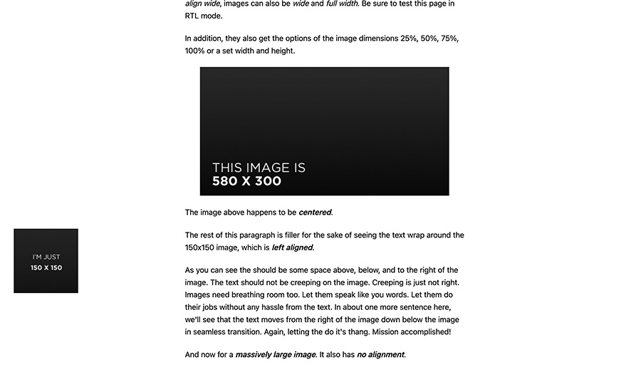
The image block allows you to quickly add an image to the page.
This is much easier than what we had with the classic editor. You can easily align images to the right, left or center or make them wide aligned or the full width of the page.
You can also quickly add a caption to a block, and you can crop the image and even add in a duotone filter to the photo from the toolbar. By default, you can also add in rounded borders to your image from the block styles area if you want.
Cover
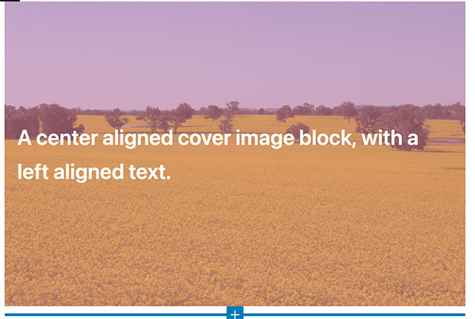
One of the cool new blocks that’s available and you might use is the cover block.
This makes it easy for you to create a section of content that has an image as its background. When you add a cover block, you can select a specific image for the background or choose the featured image for the post or page or even just select a background color.
But the real power in the cover block is the ability to nest blocks inside of it. This means that you can add in additional blocks inside the cover block. For example, you can add in a heading block, paragraph block and a button block to create a cool callout section to your page.
The cover block can be a great way to create eye-catching layouts for your content.
Group
The group block is basically a container block. Like the cover block, you can nest any type of block you want inside of it, which makes it a great block to create a section of the page.
For example, I use the group block to create separate sections of a landing page. I’m able to give it padding on all sides along with a background color to show that this is a new section of the page.
You can also use group blocks to create cool designs on the page. If you want to see what designers can do with group blocks, check out the Museum of Block Art.
Columns
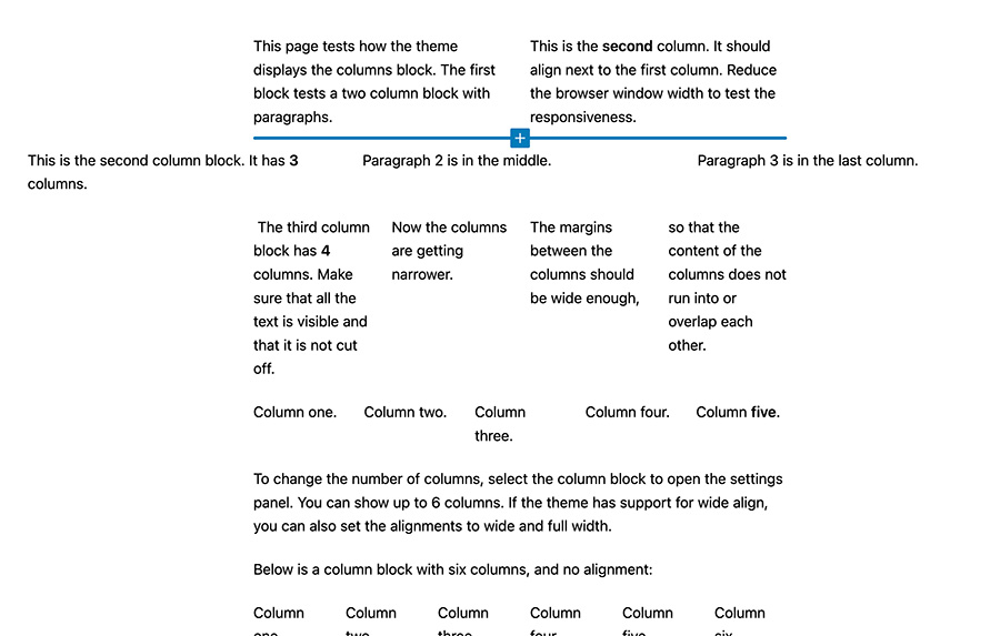
Finally we have the columns block.
The columns block allows you to create columns inside of your content, and it’s one of the best layout blocks that we have.
Before the block editor, if you wanted to create columns you either had to install a plugin that allowed you to use shortcodes or write your own code to create columns.
Now you can just add in this block and add in any number of columns to a section. And you can align items inside the columns vertically to make things look better visually.
The one challenge with the columns block is how it looks at smaller screen sizes. You’ll want to check your sections by shrinking your browser window to make sure they look good as the screen size gets smaller.
But it’s still a very powerful tool.
If you want to check out all of the blocks you can use on your website, you’ll want to check out FullSiteEditing.com.
How to add blocks to your website
By default, WordPress comes with a number of core blocks you can use. And for the most part they are pretty good and continue to get better.
But you’re likely going to want to add in more blocks to your library so you can do more things with your posts and pages.
The good news is that adding in third-party blocks is pretty easy. In fact, in most cases it’s just as easy as adding in a new plugin.
Some plugins you’ll find in the plugin directory only exist to add in a specific block. For example I created the Featured Content Block, which allows you to select a specific post or other custom post type item to highlight on the page. This plugin has just one block.
Meanwhile, other plugins have a suite of blocks that they’ll add into your website. For example, WooCommerce now has blocks that it adds to your website to allow you to show your products, have an add to cart button and more.
You can see if a plugin will add in a block or blocks to your website, you can see what blocks it adds at the bottom of the plugin’s page in the directory.
Also, you can also add in blocks from the block inserter if you search for a keyword that doesn’t match a block currently on your website.
It’s a pretty neat feature, but please be careful and only add in blocks that you need for your website and nothing more. Otherwise it will hurt your website.
What are block patterns?
There are also things called block patterns that you can add to your website. And these are essentially a group of blocks that create a section on your page.
Most of the block patterns you’ll see are contained within a group, cover or columns block.
One common block pattern you’ll likely come across is a pricing table, which is basically a columns block that contains blocks within each column that create a pricing table. You might also consider adding in a hero section block pattern, which would be a cover block that takes up the height of the screen and contains text and a call to action inside of it.
If you want to take a deeper dive into the world of block patterns, you can check out the blog post below.
How to add block patterns to your content
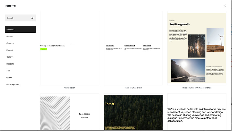
There are currently two different ways you can add a block pattern to your post or page.
The first way is by using the “Patterns” tab of the block inserter. Here you can browse through all of the block patterns that are available on your website, find the one you want and add it to the content.
The second way is by copying them from the patterns directory. You can search through the directory to find the one that you want for your website. And then you can hit the copy button and then go to the post or page you want to add the pattern to and paste it there.
Once you’ve added a block pattern to your post or page, you can edit the content of the pattern to match what you need. And don’t worry. Your content changes here will not affect the same pattern you’ve added to other pages.
Creating your own block patterns
At the moment there isn’t a way for a user to create a block pattern and save it to their website without using code. At the time of this writing, apparently WP Engine is working on something to help you do that, but it hasn’t been released yet.
One hack you could come up with is to create a draft page and create your patterns there and save the draft. Then you can come back to that page, copy the pattern you need and add it to the page you’re working on. It’s not an ideal solution, but it can work until a no-code solution is added to the block editor.
What are reusable blocks?
Finally, you might have heard about reusable blocks. But what are they?
To make it simple, they are like block patterns. You can create a group block, put other blocks inside of it and then save that group block as a reusable block. And considering we don’t have a way at the moment to create block patterns without using code, they can be a good way to get around that.
But unlike block patterns, when you change a reusable block in one area, it will be changed wherever else that reusable block is on your website. This can be both a good and bad thing, depending on what you want with that reusable block. But just know that it does that before you use a reusable block.
Upgrade your block editor experience with the Crosswinds Framework
Want to make your block editor experience better today? You’ll want to get started with the Crosswinds Framework today!
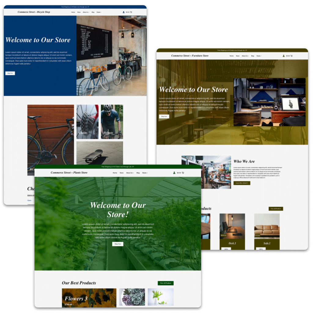
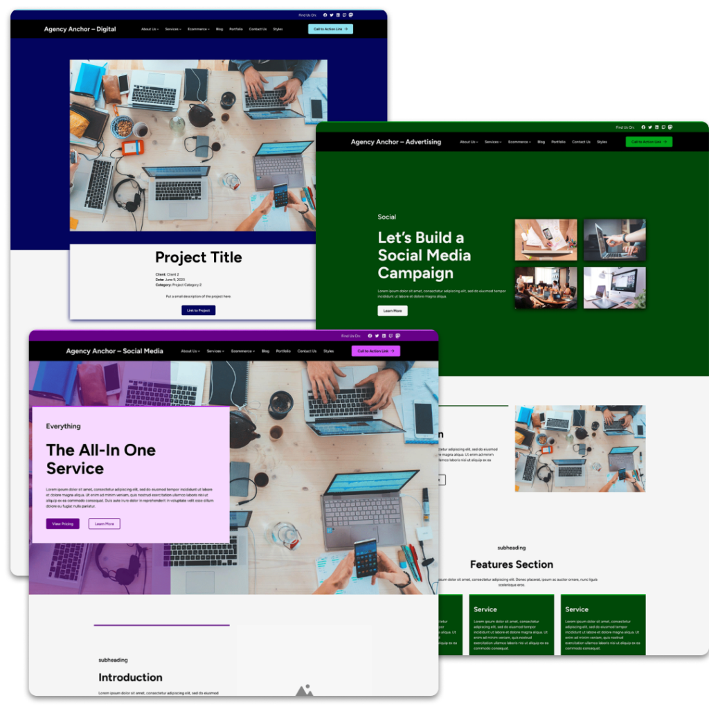
The Crosswinds Framework theme and Crosswinds Blocks plugin make editing your posts, pages, other post types and even your entire site much better. From over 12 additional blocks, better responsive layouts and over 30 patterns, you can become a pro at using the block editor.
Plus, you can chose from one of the premium child themes to quickly create a website in just minutes.
It’s the best way to use the WordPress block and site editors today!
Tags:

