Comments are a great way to foster discussion on your blog posts. They allow your readers to react to what you’ve written, ask you questions and talk with other readers.
And the WordPress site editor makes it easier for you to add and customize the way comments look on your website through the comments block.
This one block, with a host of different inner blocks, will allow you to create that section to help the discussion grow on whatever you write. It’s a really powerful block that’s fairly intuitive to use once you get started.
So let’s dive into see how you can use the comments block on your website.
What is the Comments Block?
So first things first: what exactly is the comment block?
Well the simple answer is that it allows you to add in a comments section to your single post template, page template or single template for any custom post type.
The slightly more complicated answer is that it’s really a container block for a bunch of other comments blocks that won’t work in any other context. If you were to go ahead and add a comments block, you’ll notice that it adds a number of other blocks inside of it as well.
The real power of the comments block is that you can customize how your comments section looks on your website. You can choose to have the comments form above or below the list of comments. And you can customize how each comment looks similar to how the post template block works.
The comments block won’t allow or disallow comments on your posts and other content. You can set that at the global level or on a post-by-post basis.
Comments-related Blocks
There are also a subset of blocks that can only be used within the context of the comments block.
The first is the comments template block. This is extremely similar to the post template block we’ve discussed before. This is where you can customize how each of the comments looks in the comments section.
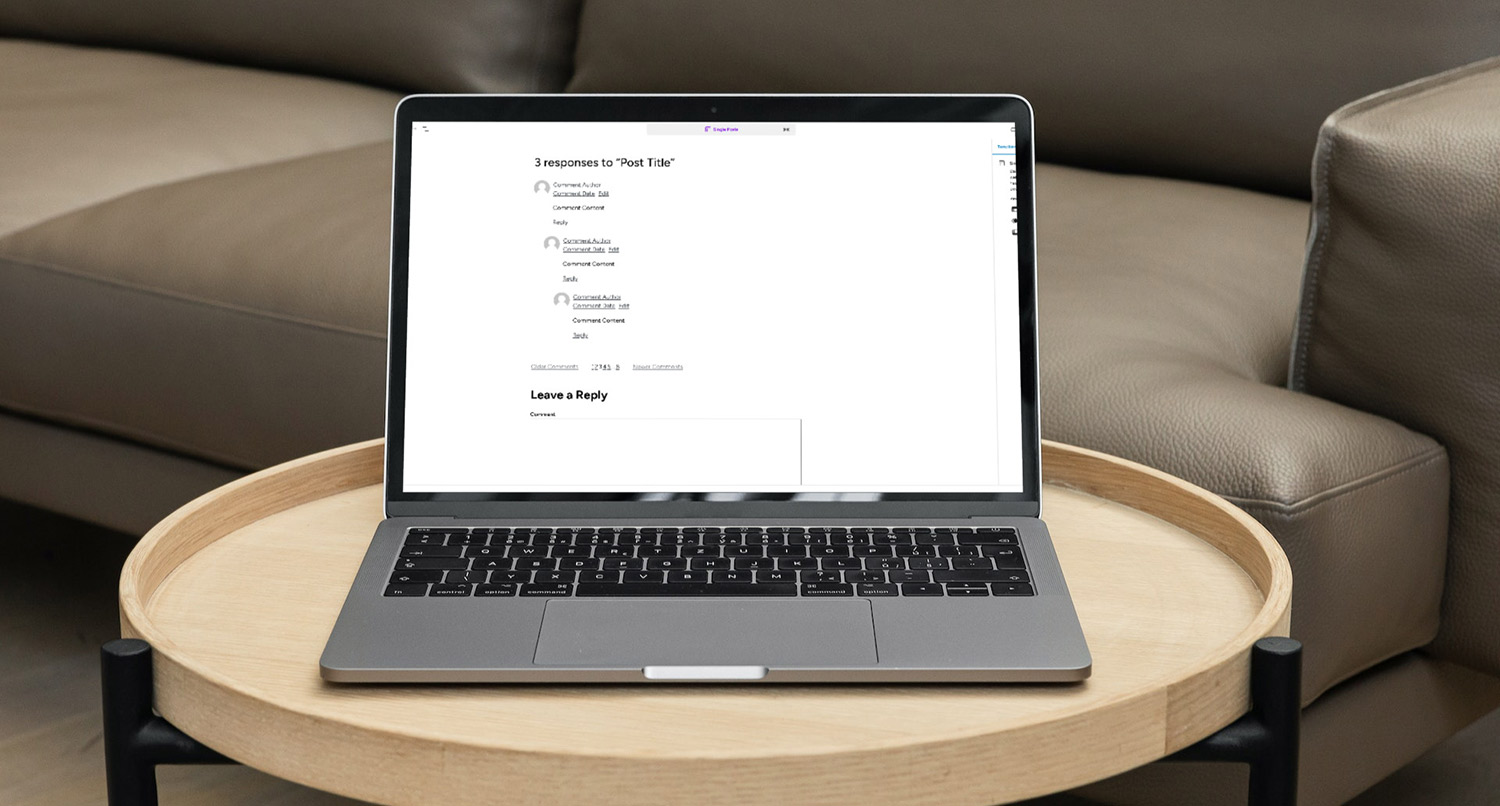
Here you can use the avatar, comment name, comment date, comment content, and comment edit and reply link blocks to really make each comment look the way you want it to look. And you can use other blocks, like the group and columns blocks, to help arrange and style the comments.
Next is the comments form. This block adds in the form for someone to enter in their comment for the post (or page or other post type). The comments form block doesn’t really allow you to edit the content of the comments form, unfortunately.
After that is the comments title. This block adds in a title for your comments section. It’s very similar to the heading block except that on the content side you can only edit whether it shows the post title and whether it shows the number of comments.
Finally, there’s also the comment pagination block, which allows you to divide your comments up into different “pages” if there are a lot of comments on a post. And then there’s the
Adding the Comments to Your Template
Adding the comments block to your template is pretty easy.
First, go to edit your single post template. You’ll probably want to scroll down until after your post content block. Then add a new block and select the comments block.
The comments block will add in a selection of other blocks inside of it that you can use, including the comments title, comments and comments form blocks.
At the moment there’s not a whole lot you can customize with these blocks except to rearrange them and change some of the styles like you would with other blocks.
We’ll dive into customizing how each comment looks in the next section.
Customizing How Comments Look
Customizing how each of the comments looks is very similar to the post template block we talked about in a different blog post.
When you add the comments block to the template, it will show a handful of dummy comments you can use to stylize and customize how comments look in the template. By default, you’ll have a row that has the comment avatar, author and date with the comment content beneath it.
How you customize the comment really depends on what you want to do.
You can use any available block, like the columns and group block, inside of the comment. You can change how the reply link looks (like a regular link or a button). And you can change where things are located and more.
Really, the sky is the limit when it comes to crafting your comments section.
Do’s and Don’ts for the Comments Block
Finally, let’s end with a couple of do’s and don’ts when it comes to the comments block.
First, do think about whether comments are beneficial for your website or not. That answer isn’t the same for every website. While it’s great to have discussions on your website, moderating comments, especially if you’re dealing with something controversial, can be a massive pain. So figure out if it’s worth having comments on your website.
Next, do make sure that you have a reply and edit link for each comment. This seems like a pretty basic thing, but now that you’re editing how comments look, it can be really easy to accidentally remove them. Those buttons are critical since they help someone easily reply to someone else’s comment or edit their own.
Finally, use a custom template part to make managing comments easier across all templates. If you have different post types and want the comments section to look the same on all of their single templates, using a template part for comments is the best way to go. That way you only need to make the changes in one spot.
On the other hand, don’t get too crazy with the way your comments look. Simpler is better. You aren’t going to win an award for your comments design. Name, date, content and the edit and reply links are really all that you need.
Finally, don’t forget to have important information like author name and comment date. Again, this seems like a really easy one, but it can get you if you’re not careful.
Get Started with the Crosswinds Framework
Want an easier time using the comments block and customizing how comments look like on your website? Then the Crosswinds Framework might be what you’re looking for.
Each Crosswinds Framework theme uses the comments block by default, meaning you can jump right into customizing the block to be more to your liking. And some themes allow you to show the number of comments elsewhere on your posts and link to the comments section so your readers can jump right into the discussion.
Plus, the Crosswinds Framework makes it easy for you to create an entire website the way you want it to look right from the dashboard. From complete page patterns to many, many different patterns to use on your pages, you can create your perfect website in just an hour or two.
So check out the Crosswinds Framework today!
Tags:



Editing Your Archive Template with the Block Editor