When the site editor was released into WordPress core, we got a whole new set of blocks to use on websites. And this included the WordPress site blocks.
The site blocks include (for our purposes in this blog post at least) the site title, site tagline and site logo, though we will also briefly talk about the navigation block.
These are a pretty powerful set of blocks that can help you create amazing headers, footers and basically anything else you might want to build on your website that incorporates those things.
So let’s dive into learn more about the WordPress site blocks and how you can use them on your website to create amazing sections.
What are the WordPress Site Blocks?
So what exactly are the WordPress site blocks that you can use on your website?
To put it in simpler terms, they are a set of blocks that are related to your website — the title, tagline and logo.
I know that technically the “theme” category in the block inserter has more blocks than these three that could be considered site blocks, but for the sake of this article we’re just going to focus on these three. The others will be covered in other blog posts.
Site Title
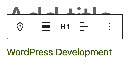
The site title block, well, displays the title of your website. This is what you’ve set for the site title option in the general WordPress settings in the dashboard.
This block has a couple of settings. First, you can set the heading level for the title or make it a paragraph. I recommend making it a paragraph simply because you can only have one level one heading on a page, and that will almost always be the title of the page or post (or other content type).
You can also make the site title link back to the homepage if you want. And you can style it like any heading block, with options for colors, typography, padding and margins, and borders.
Also, if you change your site title with this block in the site editor, it will actually change the title of your website. Just wanted to give you a heads up.
Site Tagline
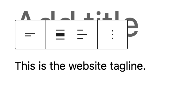
Next up is the site tagline block which, as you might have guessed, displays the tagline for your site. This is what you’ve set for the site tagline option in the general WordPress settings in the dashboard.
Unlike the site title, the site tagline is basically only a paragraph. But you are able to style it like a paragraph with options for colors, typography and spacing.
And just like the site title, making a change to the tagline through this block will actually change the tagline for your website.
Site Logo
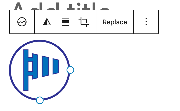
The site logo block displays the logo for your website.
I hesitate to equate this to the header image options classic themes allow you to change through the customizer because the logo really should be a square. If you want to have a header image, you really should just use an image block and make that link back to the homepage.
You are able to control the width and height of the site block. And you can make it link back to your homepage.
Also, changing the site logo through this block in the site editor will also change the little favicon that goes next to your web pages’ title in the tab in your browser.
Navigation

So I’m not focusing a whole lot on the navigation block in this blog post. Really, it deserves its own blog post. But I do want to briefly mention it because it sort of ties in with these other three blocks and we’ll be talking about it when we discuss creating a header and footer.
The navigation is a powerful block that allows you to create navigation menus through the site (and even block) editor. But it’s definitely a tricky block to use, and it can be a bit confusing at first (hence why we’ll cover it deeper in its own post).
Basically, you can now create navigation menus anywhere on your website instead of having to rely on your theme to do that. You can add items to a menu in the site editor, although it takes some getting used to. And you can control how it looks — is there a mobile menu for it, how do items align, etc.
And it is getting better with each update.
How to Use the WordPress Site Blocks
Using the site blocks, as you’ll see here in a moment, is really pretty easy. You can use them just like you would any other type of block.
That being said, you really only need to use them in the site editor. And you should use them judiciously. You don’t need to plaster them everywhere.
Really, just using them in your header and footer is probably enough.
Creating a Header with the WordPress Site Blocks
Now that we know more about the WordPress site blocks, let’s try using them to create sections on your website. First up: the header. We’ll go over doing this deeper in another blog post, but for now let’s take a high-level overview of how to do this.
Let’s try this out either on the WordPress Playground or with a local development environment, like Local WP.
To get started, let’s add a group block to the page and make it full width. This will be our container for the header. Let’s also give it a little bit of padding.
Then we’re going to add in another group block, but this time it will be the row variation and we’ll align it wide and make the elements fill the entire row. We’ll use this block to align our header items horizontally across the page.
Next, we’ll add in the site logo block. We’ll make it 50 pixels high so we don’t have a super tall header, and we’ll make sure that it links back to the homepage. Then we’ll add in the site title, which will eventually be in the center of the page. Like I mentioned earlier, let’s make sure this has the paragraph tag instead of a heading.
Finally, let’s add in a navigation block. Again, we’ll talk about this more in another blog post, but just add one in here, and you can start to play around with the block if you want. Just make sure to add in a few menu items.
From here you can play around with the colors and other styling to get it looking just the way you want it.
But now you’ve created your own header with just the WordPress site blocks!
Creating a Footer with the WordPress Site Blocks
Finally let’s try to create a footer using the WordPress site blocks.
Again, we’re going to start with a group block to act as a container. Make it full width and add some padding.
Next, add in a columns block. For this example, make it three columns and align it wide.
In the first column, we’ll add in the site title, tagline and logo. The order is completely up to you.
In the center, we’ll add in a navigation block. Again, just add in some items, but make sure this time that it doesn’t display the mobile navigation at mobile screen sizes.
Finally in the middle column, we’ll create a call to action section. For this we’ll add in a heading block, paragraph block for more text and a button that takes you to the page you want them to go to. If you want people to subscribe to a newsletter, you could also replace the button with a sign up form.
And now you’ve created a footer for your website.
Get Started Using the Crosswinds Framework Today!
Want to get started using the WordPress site blocks in an amazing block theme today? Then you’ll want to use the Crosswinds Framework!
Whether you’re looking for a blank canvas to create the website of your dreams (or others; dreams) or want to get started with a great design that builds you a website in minutes, you’ll be able to use all of the site blocks to create amazing headers, footer and, well, anything else you want.
So take a look to see how the Crosswinds Framework can help you today!

