Your website’s footer is the last thing people are going to see when they go to your website. But that doesn’t mean that it’s not important.
There’s so much you can do with a footer, from adding in a final call to action to linking to places where people can find you to adding more navigation menus to help people move around on your website and so much more.
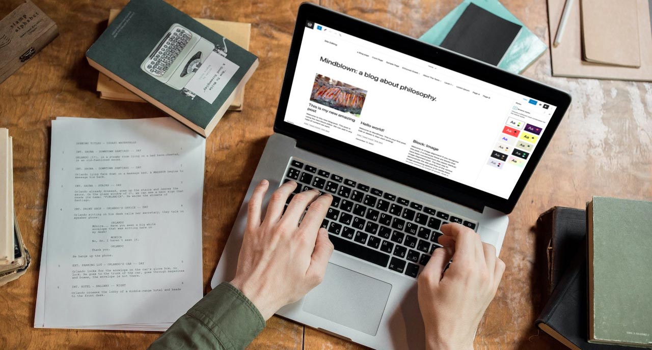
And the WordPress site editor makes it super easy to create and customize the footer for your website.
So in this post we’re going to walk through how you can create a really cool footer for your website through the site editor.
Let’s get started!
Blocks You’ll Need to Create the Footer
Before you get started creating a footer template part, let’s go through the list of blocks you’ll most likely use to create the footer.
The big one is the group block. You’re going to use this block as your container to throw everything into.
Next, you’re going to have the site title, tagline and logo blocks. Depending on what you want with your footer, you might not use all three of these, but there’s a chance.
After that is the navigation block since you’re going to be adding a menu or multiple menus to your footer.
Also there are the social icons block and the buttons block. You might want to put links to your social media profiles so people can follow you there in your footer. And you’ll need a button for creating a call to action section (more on that later).
Next you’ll probably use the heading and paragraph blocks (again for a call to action section) and maybe an image block if you want to display a business logo that’s different from your site logo.
And finally you’ll need a copyright block, preferably the one from the Crosswinds Blocks plugin.
Now that you know what blocks you’re going to be using, let’s build your footer.
Creating the Footer Template Part
Creating a footer is fairly straightforward.
First, you’re going to need to go to the site editor and then select “Patterns” and then “Template Parts”. Then hit the button to add a new template part. Give this template part a name and assign it to the header category.
Once the editor screen loads, add in a group block that will be our container for the header. You can style this group block however you want to give the footer the look you want it to have.
From here, things depend on how you want your footer to look.
If you want something really simple, you could just make that group block a row with a copyright block, site title and menu all in a line at the bottom.
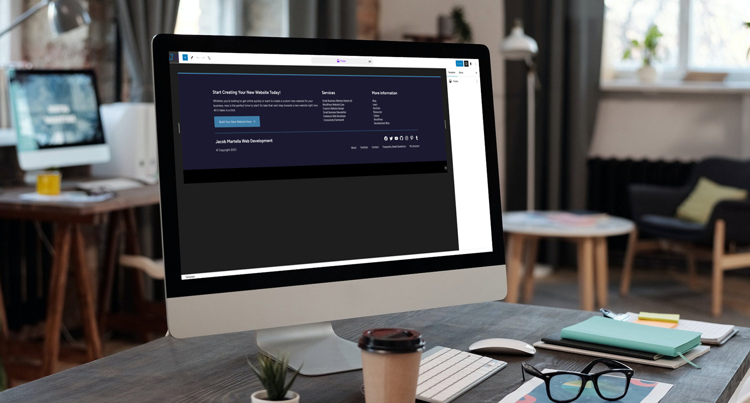
Personally, I like a menu with columns and maybe a call to action button. To create this footer, you’re going to add in a columns block and set it to three columns.
In the first column, add a heading block, paragraph block and button block. Add content to make this a call to action for whatever action you want someone to take on your website.
In the next column, you can have your site title, maybe the site logo, social icons and contact information.
Finally, in the last column add in a vertical menu.
But take some time to play around with your footer to see what works the best for your website.
Working with the Navigation Menus
The hardest part about creating or editing the footer template part is the navigation menu.
I’ve already talked about the navigation block in depth in a prior blog post that you can read.
But let’s talk about the navigation menu in relation to being in the footer.
If you have a menu in columns in your footer, you’ll want to make sure that they are the vertical orientation. On the other hand, if you have a smaller footer or a smaller height area for a particular footer menu, make sure that it’s horizontal.
In either case, make sure that the overlay option is turned off. Otherwise your menus will look odd on mobile devices.
A Look at Calls to Action
Now, I’ve talked a lot about calls to action. But if you’re new to websites, you’ve probably never heard that term before or what they are.
Hotjar defines calls to action as “a prompt on a website that asks users to perform a specific action like signing up for a newsletter, downloading a demo, or buying a product.”
Most likely this is going to be a button on a page that takes them to another page that moves them down your conversion funnel. But it could also be a form. In fact, if you scroll down to the end of this post, you’ll see a call to action for the Crosswinds Framework Newsletter.
Now, while you always want a CTA in your hero section or above the fold, having a CTA in the footer is a good idea. It’s another reminder of what they should do once they’ve read through the entire page.
So consider use the opportunity in the footer to add a CTA for a newsletter sign up, buy now, view shop or some other button so that the user takes the action you want them to take.
Do’s and Don’ts
Let’s take a look at some do’s and don’ts for creating your website’s footer.
First off, do try to have a call to action if it fits your website and your design. The goal of your website is to get the user to take some sort of action — click a button, sign up for a newsletter, buy a product — and a footer call to action can help.
Next, do try to have at least one menu down here. It could be a set of menus that help a user navigate to every section of your website or it could be simple with a couple of items. The choice is up to you, but do have a menu.
Finally, your footer should have a subtle design that makes it clear it’s a different section on the page, but it shouldn’t be drastically different. You could use a different background color that’s close to the color of the rest of the page (or a color with different contrast that makes sense like black and white). But if your site has a white background, don’t randomly use a neon green color (unless it’s in your branding).
On the other side, make sure your menus have overlays turned off. Otherwise your footer is going to look a bit awkward on mobile screen sizes.
Next, don’t forget to update your copyright date every year in your footer. Or you could just use the copyright block from the Crosswinds Blocks plugin to do it for you.
Finally, don’t make things too complicated or complex. Keep the user’s experience in mind and make sure that it’s easy for them to use (along with the rest of your website).
Get Started Creating Your Own Footer with the Crosswinds Framework
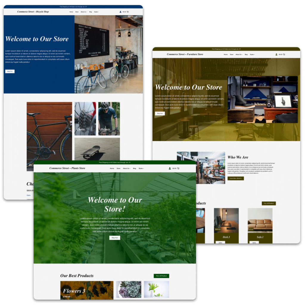
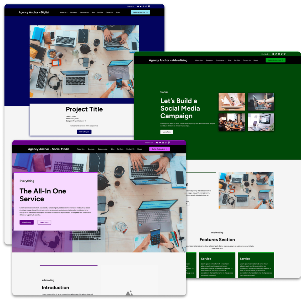
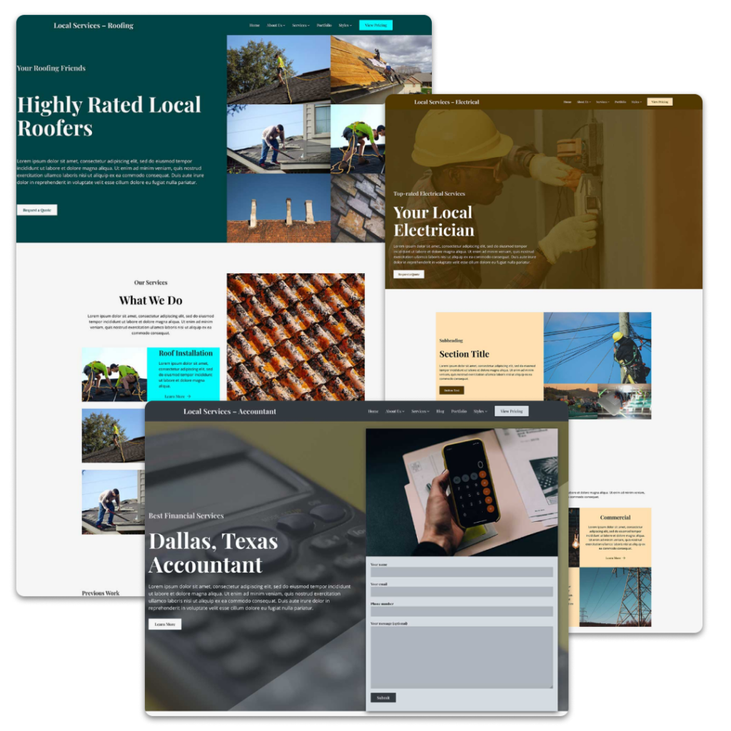
Want a great starting point for customizing your website’s footer? You’ll want to check out one of the Crosswinds Framework themes.
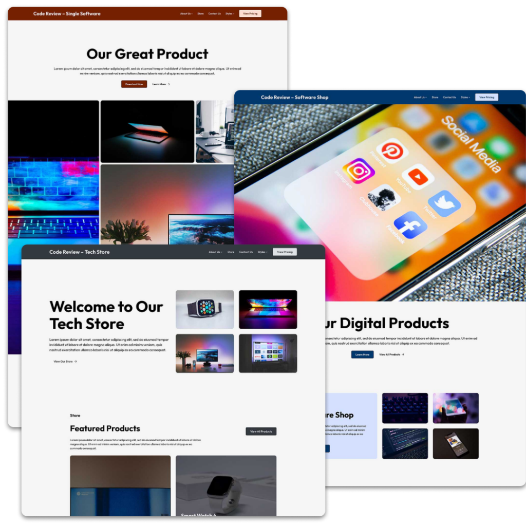
Each theme comes with a selection of different footers you can try out on your website. Whether you want the focus to be a call to action or links to your social media profile or just something really simple with the copyright text, you’ll find something that works for you.
And if not, they provide great starting points for creating your own footer. The possibilities are endless.
So get started creating a great footer and website by using the Crosswinds Framework!
Tags:

