Your header is one of the most important parts of your website.
It’s the first part of your website that people will see. It’s the main way people will navigate around your website. And it can be useful in getting people to take the action you want them to take on your website — buy a product, fill out a form, subscribe, etc.
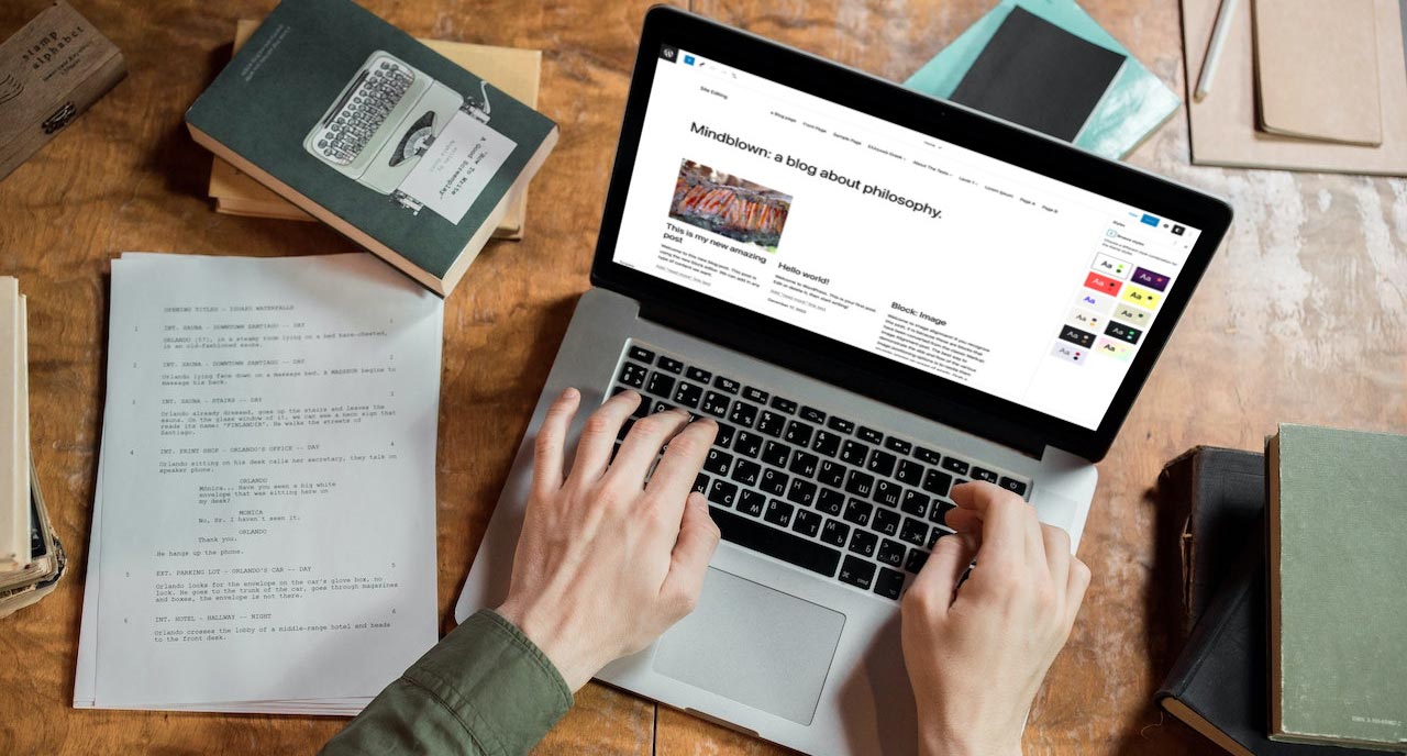
Plus, with the site editing experience in WordPress, you can now create and customize your own header. And you don’t need any code to do it.
But there are potential traps and pitfalls ahead of you if you try to create your first header.
So in this blog post, let’s take a deeper look into website headers and how you can create the perfect header for your website through the WordPress site editor.
Blocks You’ll Need to Create a Header
Before you get started creating a header template part, let’s go through the list of blocks you’ll most likely use to create the header.
The big one is the group block. You’re going to use this block as your container to throw everything into.
Next, you’re going to have the site title, tagline and logo blocks. Depending on what you want with your header, you might not use all three of these, but there’s a chance.
Next is the navigation block since you’re going to be adding a menu to your header.
Finally there are the social icons block and the buttons block. You might want to put links to your social media profiles so people can follow you there in your header. And a button in the header can be a good call to action, like “call now” or “shop now”.
Now that you know what blocks you’re going to be using, let’s build your header.
Creating the Template Part
Okay, so now let’s create a simple header.
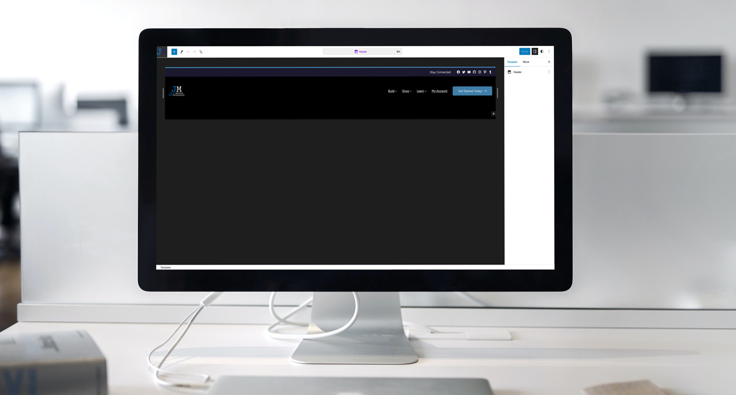
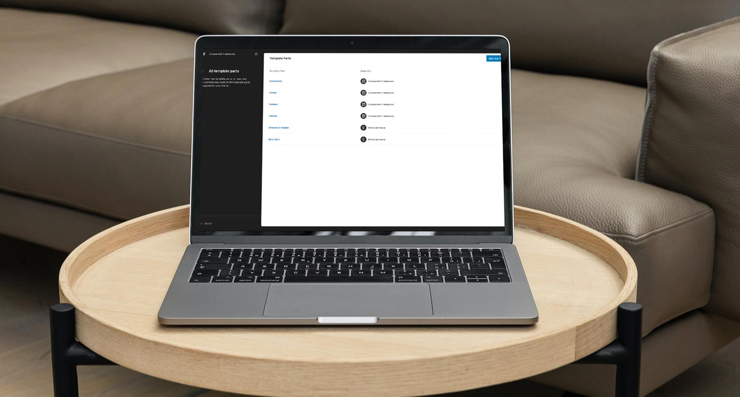
First, go to the site editor and navigate to “Patterns” and then “Template Parts”. Then hit the button to add a new template part. Give this template part a name and assign it to the header category.
Once the editor screen loads, add in a group block that will be our container for the header. You can then add the amount of padding you want to the header as well as any other styling.
From here, the rest is up to what you want to do with your header.
Personally, I prefer row-type headers with the site title or logo on the left, the menu on the right or center and a call to action button on the right. But you might want to put everything in a centered column. But you might want to put everything in a centered column.
Really, the choice is yours. You can play around with it until you get it just right. Just make sure that you have your site title or a wordmark for your business or branding and a navigation menu, and you’ve got a good header.
To switch your templates to use this new header template part, go into edit each template. Select the current header template part and hit replace. Then select your new header template part. You’ll then repeat this for each template.
And now you’ve created your own header template part.
Working with the Navigation Menu
The hardest part about creating or editing the header template part is the navigation menu.
I’ve already talked about the navigation block in depth in a prior blog post that you can read.
But let’s talk about the nav menu in relation to being in the header.
With a navigation menu in the header, you’ll want to make sure that it’s horizontal and has either an overlay on mobile or is always an overlay.
The alignment of the menu will just depend on where you have it in the header. If it’s in the center, make sure that it’s centered. If it’s on the right side, make sure that it’s aligned to the right.
Finally, make sure you don’t add in too many nested submenus so that user has a good experience and can find everything they need on your website.
Do’s and Don’ts
Let’s quickly go over some do’s and don’ts for your header, which can be really helpful if you’re not a web designer.
First, do take some time to play around with the header and figure out what works and doesn’t work. You can do this in a staging or sandbox environment. But take time to determine how you want your header to look. And don’t be afraid to change it if it’s not working.
Next, do make sure you include your site title and a navigation block for the menu. Even if you’re using an image or the site logo in place of the title, it’s still a good idea to have it there as a paragraph and using the screen-reader-text class to hide it from view. And then of course you want to have a menu so people can navigate around your website.
Finally, do make sure that you have a call to action in the header. It could be as simple as links to your social media profiles or something like a button that takes the reader to a page you want them to go to. It’s the first thing they’ll see, so it’s a great place to put a call to action.
On the other side, don’t make your header too big. Screen real estate matters and having a header that takes up over half of the screen is a bad look.
Next, don’t make your site title a level one (or H1) heading. There can only be one H1 per page, and your page or post title will be your H1. Instead, make it a paragraph.
Also, don’t try to do too much with your header. Less is more. A simpler header will look a lot better than a header that tries to do everything.
Finally, don’t make it look radically different from the rest of the page. It should be a bit different from the rest of the site, but if your brand colors are various shades of blue, don’t use a random red color as the background. Keep it similar to the rest of the site.
Examples of Block Theme Headers
Finally, I want to highlight a couple of block theme headers you might want to check out to see what they did and how you might be able to use that for your header.
First is Frost by Brian Gardner. This is one of the first quality block themes, and it’s been a great working example of how to create and use block themes. And the header is no different. You can even download it and try the theme for free so you can see how it all works on the backend.
Next is Ollie by Mike McAllister. This is another free WordPress theme you can currently download from GitHub and test on your website. I do like how the theme uses the button block and social media block in the header.
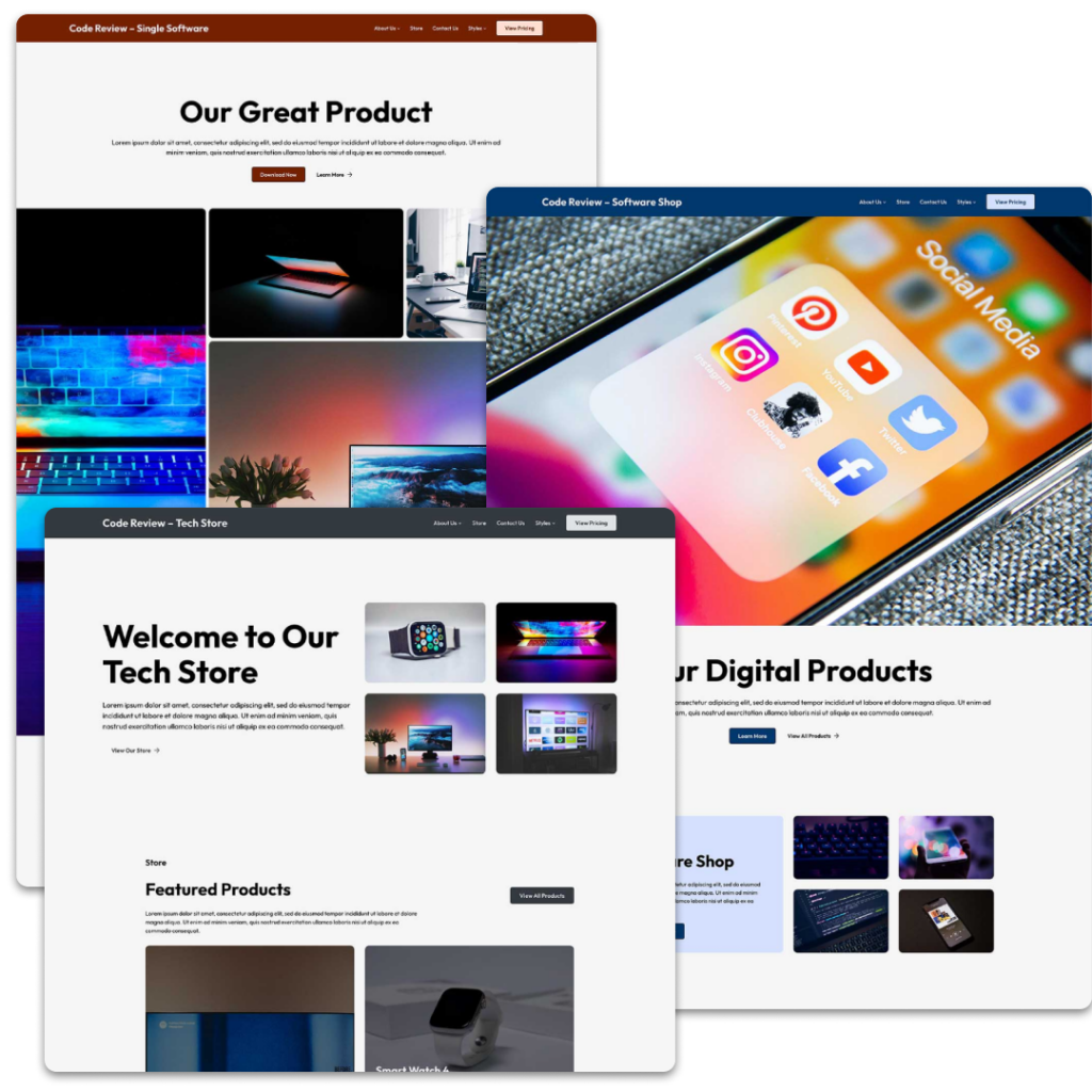
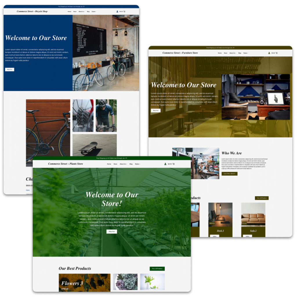
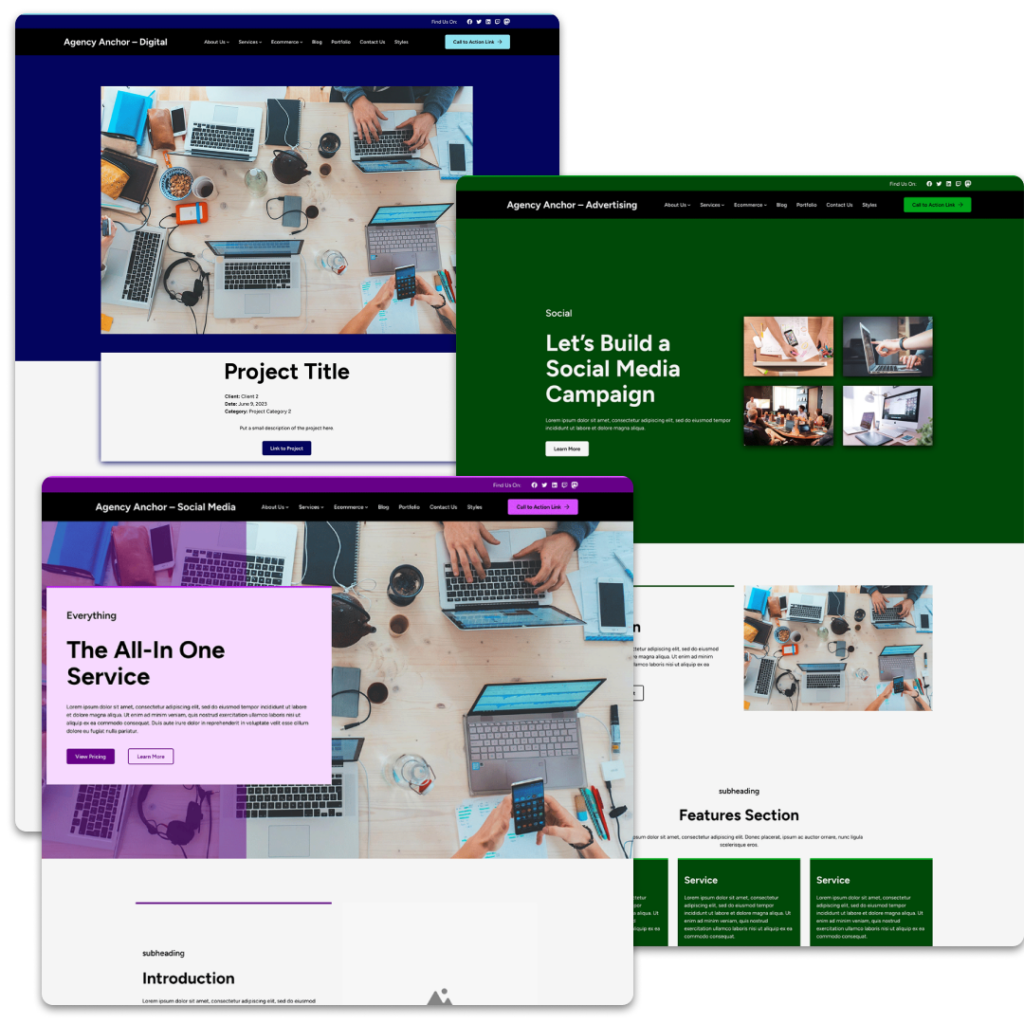
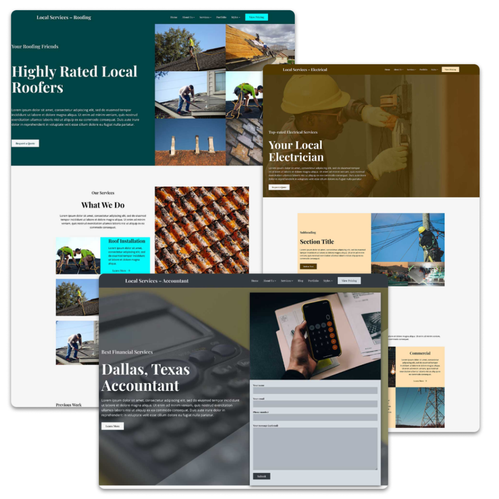
And finally you can take a look at the demo sites for each of the Crosswinds Framework themes. Each of them does something a little different in the header, whether it’s a straightforward header or uses more elements for calls to action or social media.
Get Started with Customizing Your Site’s Header with the Crosswinds Framework
Want a great starting point for customizing your website’s header? You’ll want to check out one of the Crosswinds Framework themes.
Each theme comes with a selection of different headers you can try out on your website. Whether you want the focus to be a call to action or links to your social media profile, you’ll find something that works for you.
And if not, they provide great starting points for creating your own header. The possibilities are endless.
So get started creating a great header and website by using the Crosswinds Framework!
Tags:

