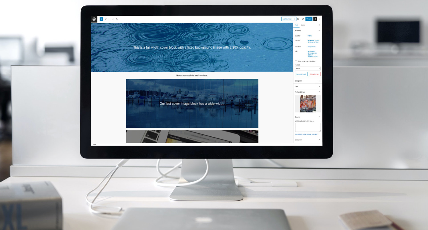
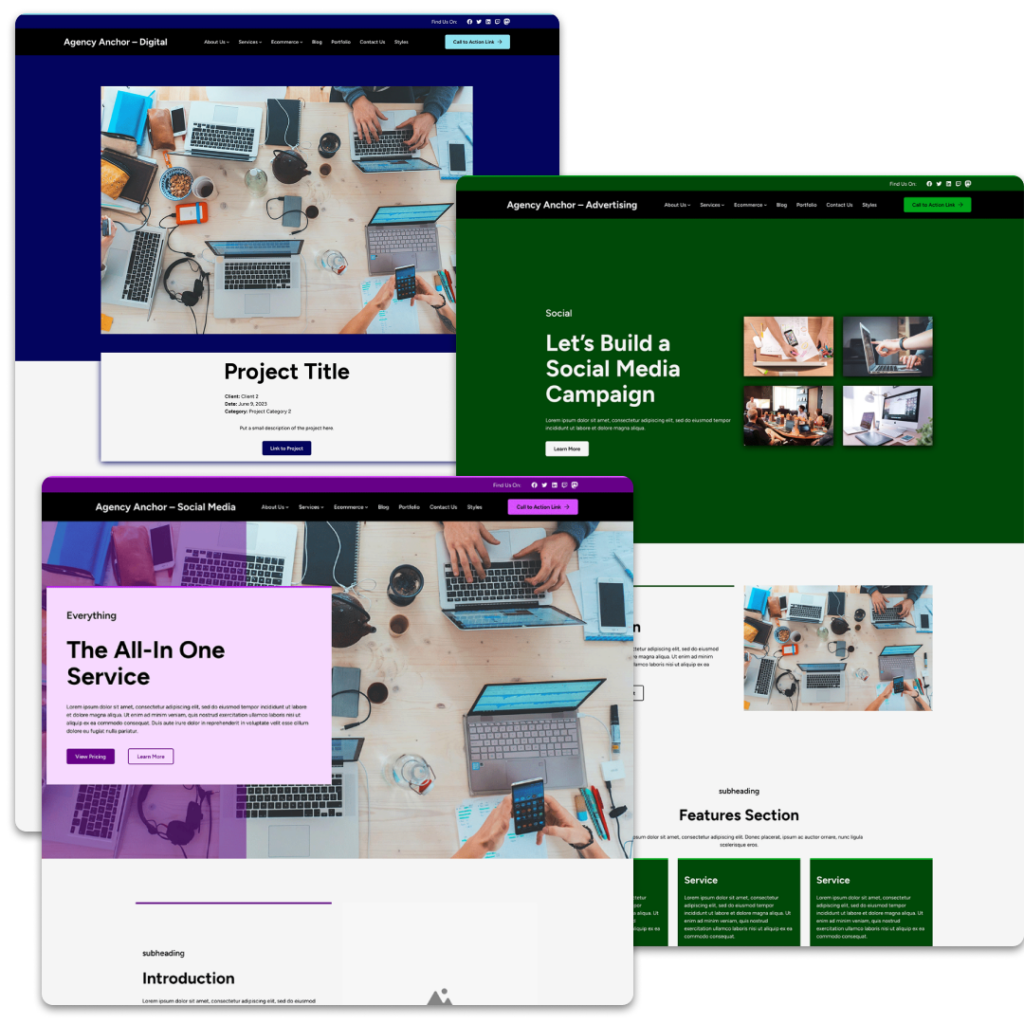
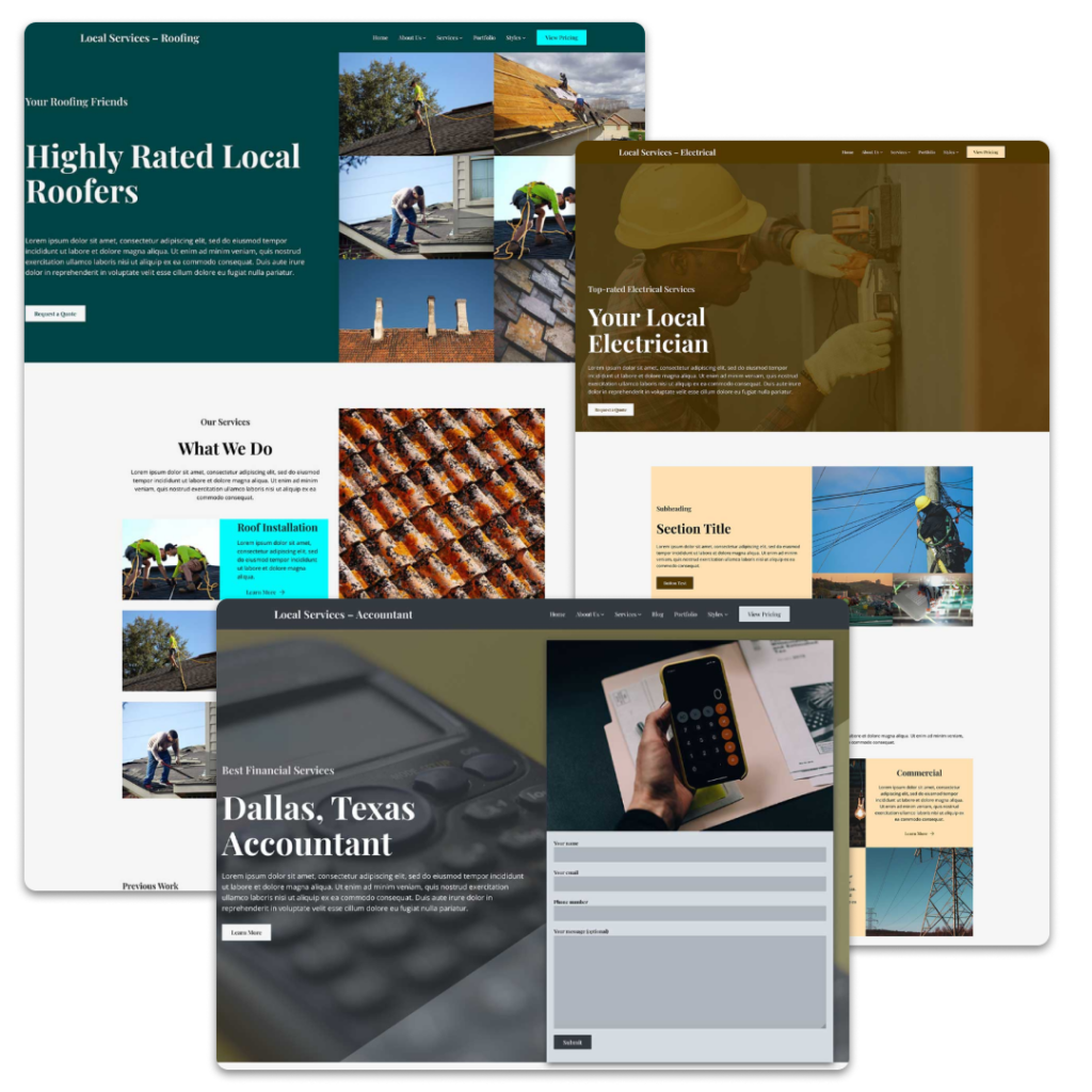
One of the coolest WordPress core blocks has to be the cover block.
No block allows you to make a statement more on a page than this block. You can use it as a way to simply highlight a quote that makes a statement. Or you can use it to quickly create an amazing hero image in a way that used to take developers an hour or two to make happen the old way.
It’s a great block that is extremely versatile for whatever you need on your page.
So let’s take a dive into the cover block to see how you can use it on your website.
What is the Cover Block?
So what exactly is the cover block?
To put it simply, the block allows you to create a section of content that has a background image and a color overlay.
In the beginning you could only have text over top of the image. Now you can add any block you want inside the cover block, which really allows you to do cool things. I’ve found one of the best uses is to use it inside of a post template block with the featured image and having the title over top of it. But more on that later.
It is also a better option than using the background image option in the group block (at least until that option gets a color overlay feature).
How to Use the Cover Block
Now let’s dive into how you can use the cover block in your posts and pages.
Selecting an Image
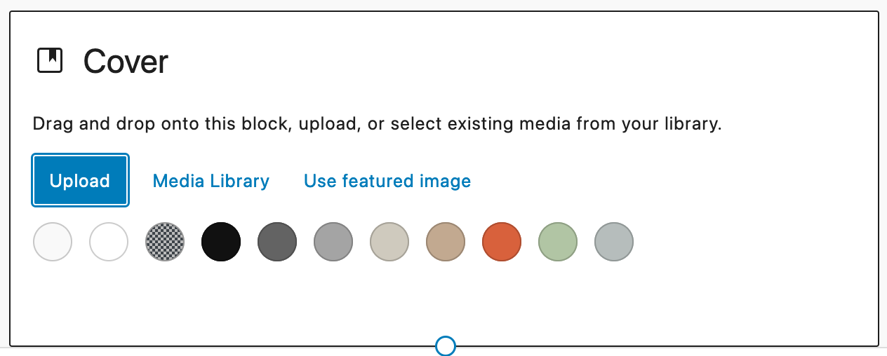
Once you’ve added the block to the content, the first thing you’re going to see is a section that asks you to select an image for the block. Here you have the option to upload an image, select an image from the media library or use the featured image for the post or page.
Also, you can select a color background for the block as well if you want.
Cover Block Settings
There are a number of options for the cover block.
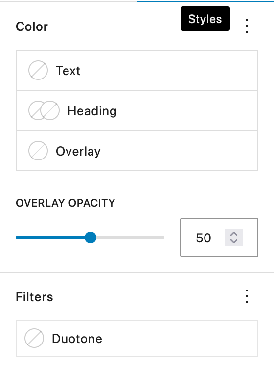
In addition to use the usual color, typography, border and spacing options, you can also set the opacity of the color overlay for the block. You’ll need to play with this so that any text is readable against the background image.
You can also make the image duotone if you want, and you can set a minimum height for the cover.
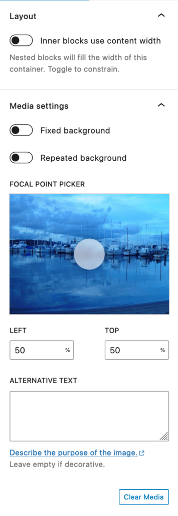
And then with the image itself, you can choose whether it’s a fixed background or a repeating background. Additionally, you can set the focal point for the image.
Finally you can control the layout settings for content inside the cover like you would with the cover block.
Adding Content Inside the Cover Block
Once you’ve added an image, you can add whatever blocks you want inside of it.
Personally, if I’m not adding basic text, I like to add a group block around everything inside of the cover to control more settings. But you can add in columns, rows, whatever blocks you want inside of the cover block.
Finally, if you’re using the cover block in the post template block, you’ll want to at least use the title block with a link to the content.
But congratulations! You’re using the cover block like a pro!
Do’s and Don’ts
Now that we know how to use the cover block, let’s go over some do’s and don’ts with using the block.
First, do make sure that you’re using an image that’s large enough to cover the section you want to fill. If you’re trying to fill a space that’s 1000 pixels wide and are using an image that’s only 300 pixels wide, the image is going to look terrible.
Next, do check for accessibility between the overlay color and text color. Color contrast is a big thing with accessibility, and it’s one of the easiest things you can check and fix. If you have a darker color for the overlay, make sure you’re using a lighter color for the text. There’s even a handy message in the inspector column by the colors that will let you know when your text and background don’t have the right contrast.
Also, make sure that the overlay has enough opacity to make the text readable over top of the image.
On the other hand, don’t set the opacity for the overlay at 0. There’s a good chance that people won’t be able to read the text, especially if it’s a complex image. Only do this if you know that the image will have the right contrast on its own.
Finally, don’t over use cover blocks. You don’t need 100 cover blocks on every page. And loading all of those images can be a burden on page speed. Plus it won’t look as good as you think it does to your users. So use this block judiciously.
Examples of Using the Cover Block
Finally, let’s go through some examples of what you can create with the cover block.
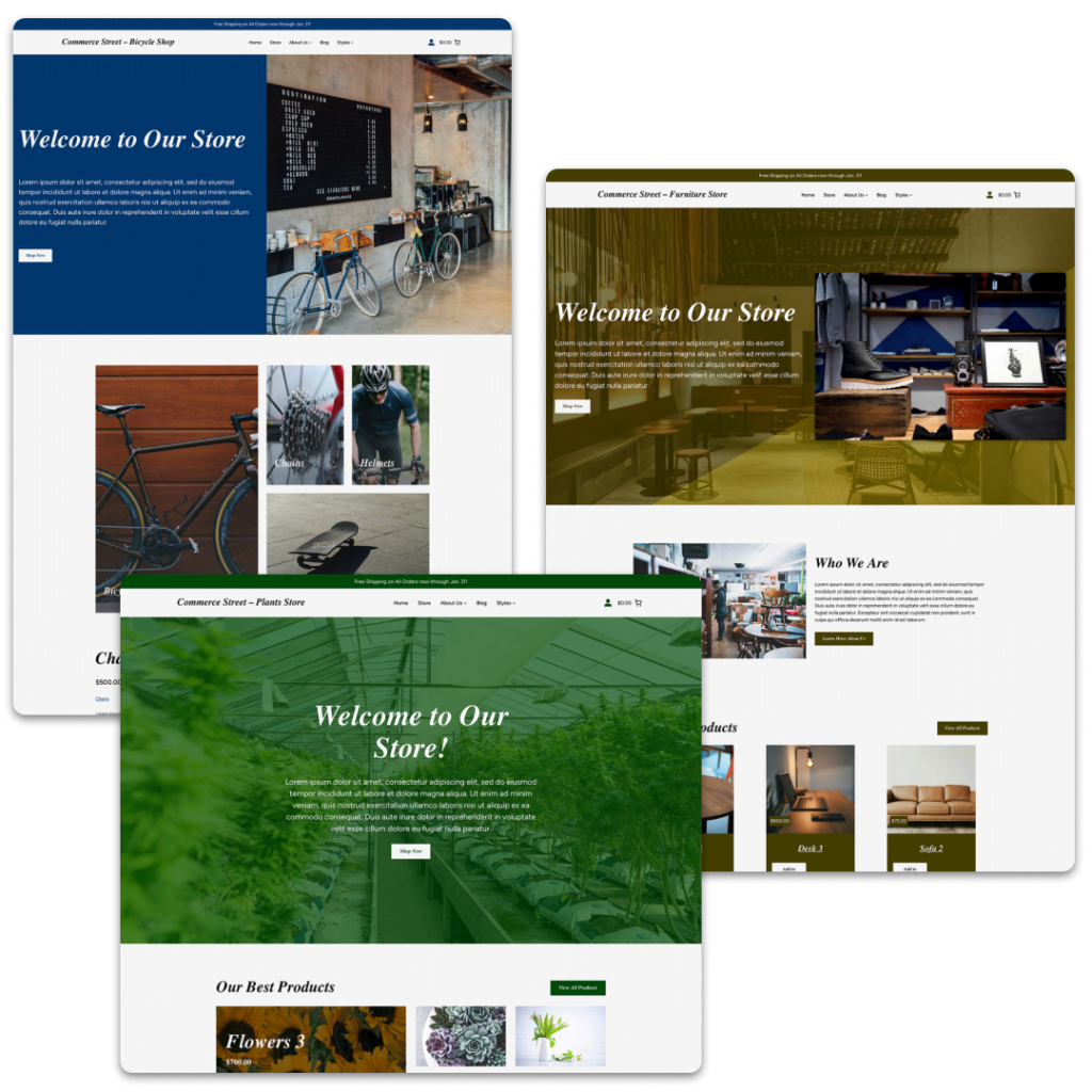
First, the cover block is a great way to quickly create a hero section. Here you’ll have your background image and overlay, and then you’ll put a heading (likely an H1 heading) plus paragraph text that intrigues the reader plus some sort of call to action. This is something that used to take us developers over an hour to code and style, but for you it only takes a couple of minutes.
Next, the block can be used for features or services. You can have a background image that relates to the feature or service you’re highlighting along with a heading and a sentence that describes the feature or service. It adds a little bit more pop than just simple text.
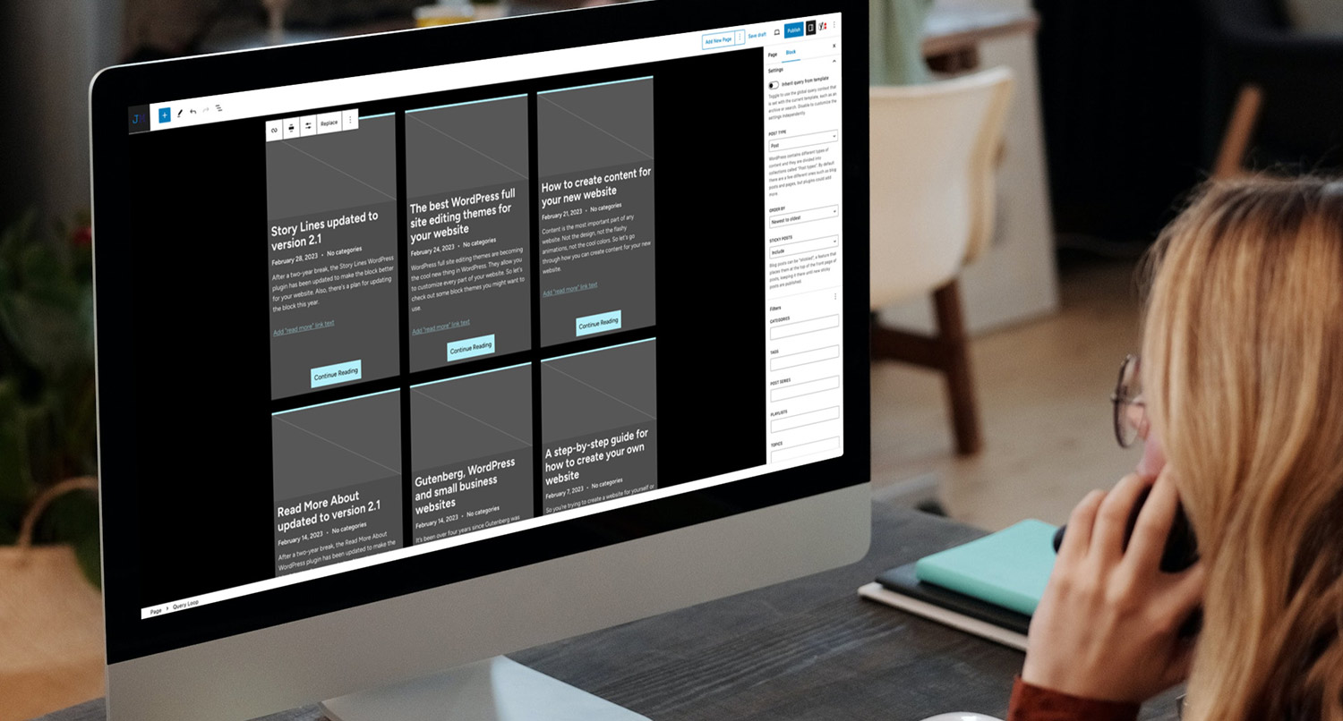
Also, as I mentioned before, I’ve found that it’s great for posts. For example, if you’re creating a landing page for a service and want to highlight a couple of blog posts that relate to that service, you can use the cover block in the post template block and put a title with a link to the post in the cover.
Another example is on the homepage of this site where I highlight four of the child themes. It’s basically the same concept.
Finally, you could use this for section headings if you want. I don’t know if I would recommend it, but if you’re creating longform content, putting major headings in a cover block might be a good way to break up the wall of text and add in some color to the content.
Get Started with the Crosswinds Framework
Want to use the cover block like a pro on your website? The Crosswinds Framework might just be what you’re looking for!
Each Crosswinds Framework theme comes with several patterns that utilize the cover block in interesting ways. And it’s easy to create your own patterns utilize the cover block however you need it to.
Plus the Framework allows you to quickly create the website you want right from the dashboard.
So take a look at Crosswinds Framework to see how it can help you today!
Tags:

