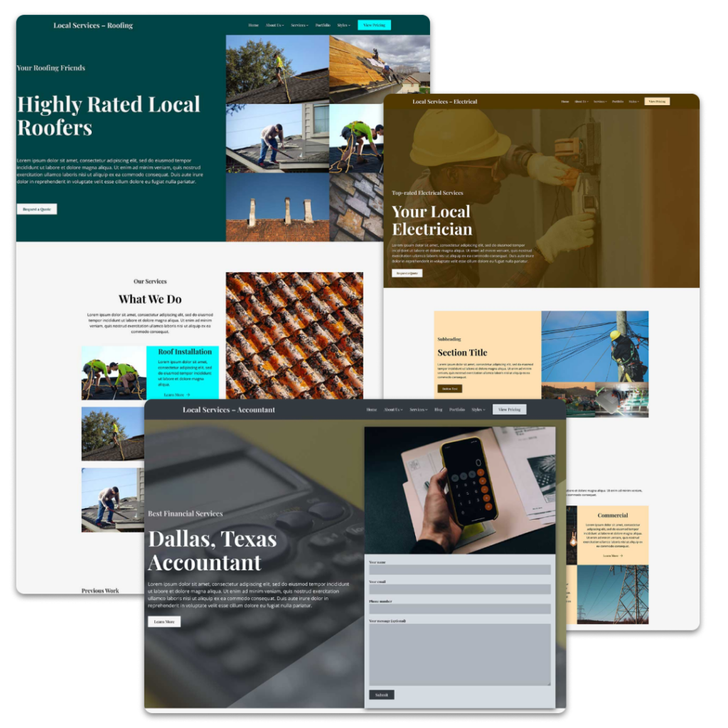
The columns block in WordPress is a tricky block.
On the one hand, it solves an issue people have been trying to work around for a long time. Creating columns in the old classic editor was a hassle. And the block editor and the columns block makes it much easier now.
On the other hand, it can be tricky to work with, especially when the screen size shrinks.
But it is a powerful block, and it’s definitely a block you’re going to be using in the block and site editors. So let’s take a dive into this block to see how you can use it and how you can get around some of the issues with the block.
What is the Columns Block?
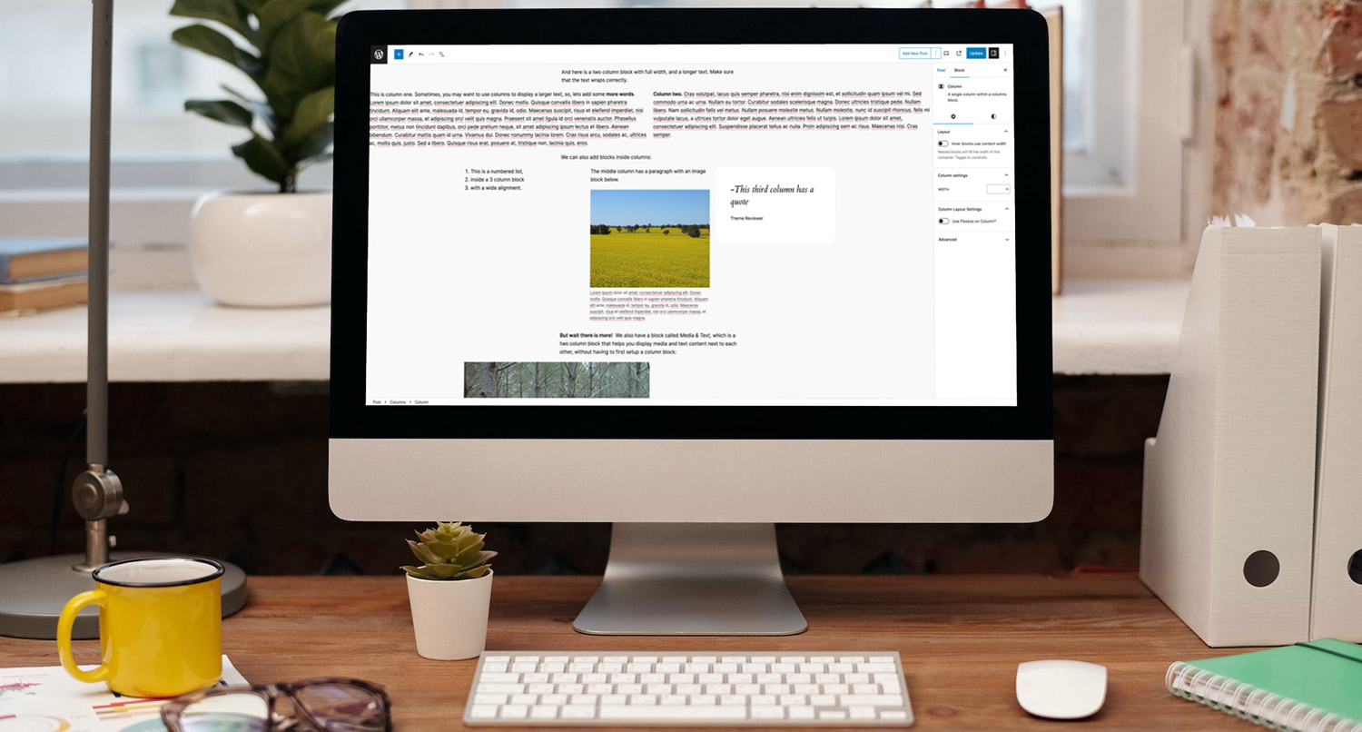
The columns block does exactly what the name says it does — it allows you to create a section of columns on the page.
You can control the number of columns that are shown as well as the alignment of content in those columns.
This was something that wasn’t possible with the old classic editor. You would have to use either a page editor or a plugin that added shortcodes you could use to create columns in your content.
Otherwise you had to be a developer and use something like ACF and PHP and CSS to create this functionality.
But with the columns block, you can quickly create cool sections with columns right out of the box. And it will look exactly the same between the front and back end.
How to Use the Columns Block
Now that we know what the columns block does, let’s dive into how to use it in your posts and pages.
Setting Up the Columns
To get started, add the columns block to your content.
Once you’ve added the block, you’ll see a selection of various column layouts. These are generally 50/50, 33/33/33, 70/30 and 25/50/25.

While you can change the number of columns and their widths later, it’s best to select the right amount now. Otherwise it becomes a bit of a hassle, especially to make sure that the widths all add up to 100 percent.
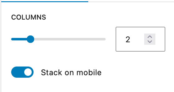
Once you’ve added the columns, in the columns block you can change the number of columns as well as whether the columns will stack at mobile screen sizes. You can also control the vertical alignment of all of the columns as well.
Adding Content Inside the Columns
Now it’s time to add in content to the columns.
For the individual columns, you can control the width of the column as well as the vertical alignment of content in those columns — top, bottom, center or equal spacing to fill the column.
Adding in content to the columns is as simple as adding inner blocks to other blocks like the group block. Just add in the content you want for that column and move on.
Now you’re a pro with the columns block.
Issues with the Block
By and large the columns block is a great block, but there is one issue.
If you have more than three columns, things get really squished at smaller screen sizes before they go to one column across. That’s something you can’t really control with WordPress core right now, which is disappointing.
If you really need to have more than four columns, you should use a theme, like the Crosswinds Framework, that adds in CSS behind the scenes that makes sure your columns look good no matter how many columns you want or the screen size a user is looking at your website on.
But just be aware that this is a limitation with the columns block.
What You Can Create with the Columns Block
So now that you know how to use the columns block, what can you create with it?
Well obviously there are the obvious text-based solutions. You know with a heading, text and maybe a button in each column.
You can also put text on one side and media on another.
Another type I like is having a section heading in one column and the rest of the text in other columns. It can be a pretty neat way to make text a little bit more interesting.
Really the options are mostly endless.
That being said, I wouldn’t use the columns block as a grid because of the aforementioned sizing issue at smaller screen sizes. Instead, I recommend using an actual grid block, like the Basic Grid block in the Crosswinds Blocks plugin.
But try to push the boundaries and see what works best for your website.
Get Started with the Crosswinds Framework
Want to get started using the columns block like a pro? Would you like a theme to come with column patterns that make it easier for you to quickly use the block and set it up the way you want it? Want to have better options than just columns, like using an actual grid?
The Crosswinds Framework is just what you’re looking for!
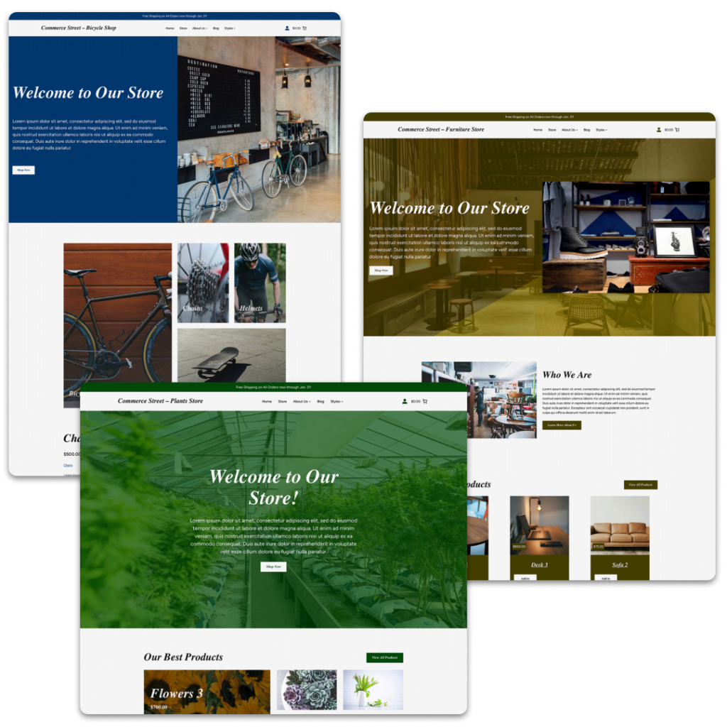
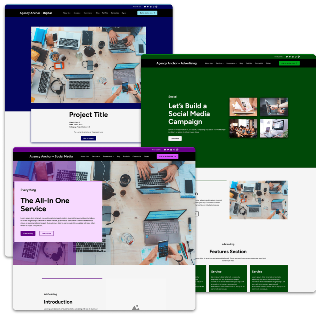
Each theme in the Framework comes with many patterns that utilizes the columns block in a unique and interesting way, allowing you to create great pages. And the Crosswinds Blocks plugin comes with a basic grid block that allows you to create actual grids that are responsive and look great no matter the screen size.
So if you’re ready to take your website to the next level, check out the Crosswinds Framework today!
Tags:

