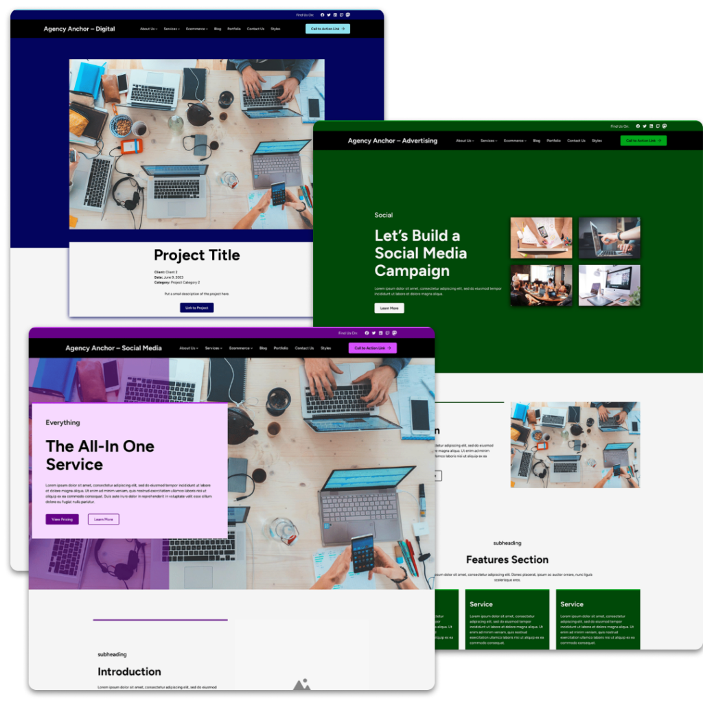
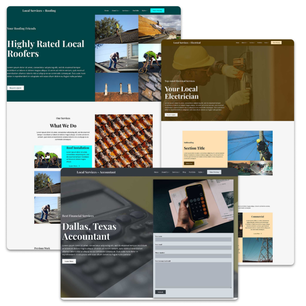
The Crosswinds Blocks plugin helps you add more functionality to your single posts (or single templates for your other post types) with a selection of blocks that can keep people on your website longer.
The post navigation block takes what WordPress core has for post navigation and takes it even further, allowing you to completely customize how those posts look.
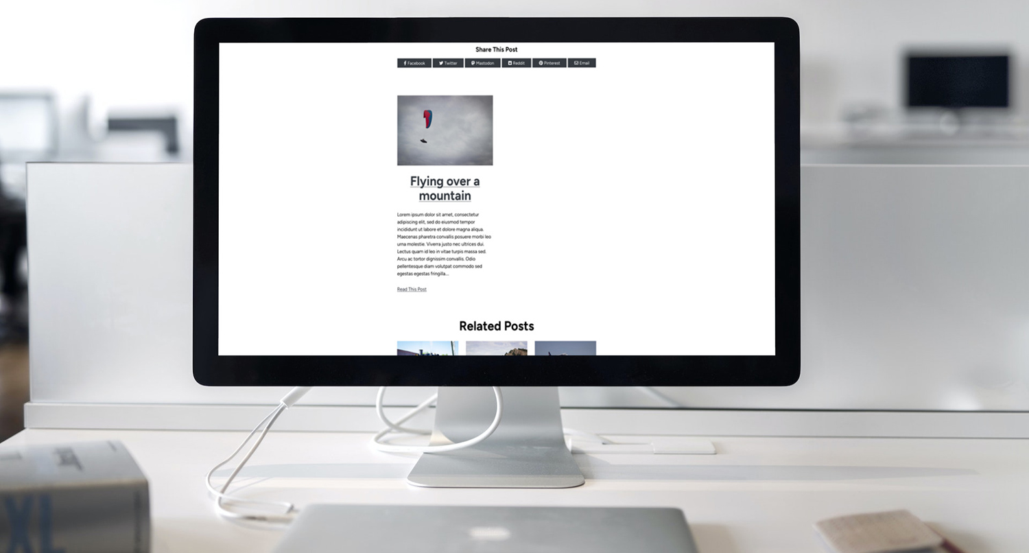
The related posts block allows you to show related posts (or other post types) based on a chosen taxonomy to help readers find content that might interest them and keep them on your website longer.
And the social share content block helps you display a section on the template where readers can quickly share that post, page or other content on their social media profiles, increasing the reach of your website.
So let’s dive into see how you can use each of these blocks to take your single templates to the next level.
Post Navigation
WordPress core already has a post navigation set of blocks. But unfortunately you’re really limited to only a couple of options for how that block looks.
The Crosswinds Blocks Previous Post and Next Post blocks give you full control over how your post navigation section looks.
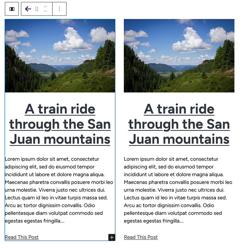
To get started adding in post navigation, you can navigate to the single post template in the site editor. Then add a columns block with two columns where you want your post navigation section to go.
In the left column, add in the Previous Post block, and then in the right column, add in the Next Post block.
For each of the blocks, you can add in any of the post blocks, from the post title, excerpt, featured image, taxonomies, date, author, link and more. You can add those blocks in any order and use any WordPress core blocks to build out the section. It’s similar to what you can do with the query loop block and post template block.
This gives you complete control over how your post navigation looks to make your single post template look picture perfect.
Related Posts
The next block you can use in your single post template is the Related Posts block.
This block allows you to show any number of posts (or other post types) that are related to the current post. This can help readers find similar posts to this one to learn more about a topic, and it keeps them on your website longer.
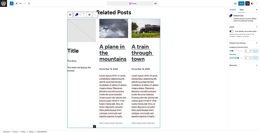
Using the Related Posts block requires an extra step.
First, you need to go to the Crosswinds Framework and Blocks settings page and then find the Related Posts settings. Here, you’ll need to select which taxonomy will be used to get related posts for each post type.
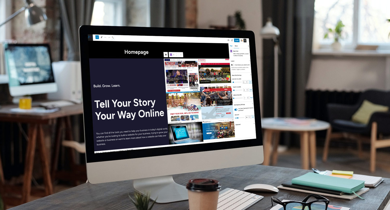
After you’ve saved those settings, you can go to your single post template in the site editor and add the Related Posts block where you want it to appear in the template. Once you’ve added the block, you can choose the number of related posts to show and the number of columns the section should have. If you want it to look like a simple list, you can use just 1 column.
Like the Post Navigation block, you can use any of the many post blocks and any WordPress core blocks to build out how the posts look just like you want it to. And just like with the query loop and post template blocks, any change you make to one post in this section will also affect the other posts in the block.
Social Share Content
Finally, the last block we’ll discuss for the single post template is the Social Share Content block.
This block allows you to add in a section where readers can share your content on their social media profiles with just a simple click, making it really easy for them to share your content and grow your reach.
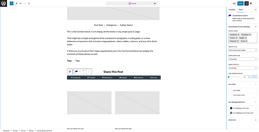
To get started, go to your single post template in the site editor and then add in the Social Share Content block where you want it to be in the template.
There are a number of options for how you can configure the block.
First, you can choose the social media sites that appear in this section as well as a link to send the content link as an email to someone.
Next, you can choose whether the section will show icons and the name of the social media site or just icons or just titles. You can then also choose whether the section will be horizontal or vertical and whether the buttons will fill the entire section or be auto width.
Also, you can determine the border radius for the buttons if you want.
Up next, you can choose the icon and text color for the buttons at the normal state and the hover and focus states.
Finally, you can choose the background color for the buttons at the normal state and hover and focus states.
And now your readers can quickly and easily share your great content on their social media profiles.

