While there’s a lot you can do with the WordPress block editor, creating grid layouts is still a bit of a challenge.
At the moment, a grid variation for the group block is still just an experiment in the Gutenberg plugin, with no set date for it being added to WordPress core. And in the meantime, it’s a struggle to
That’s where the Grid Block from the Crosswinds Blocks plugin comes right into play.
With this block, you can quickly add in a grid to any post, page or any other piece of content. And you have full control over how your grid looks, from the number of columns at various screen sizes to how many rows and columns each grid item can span.
So let’s dive in to see how you can use the Grid Block to create amazing layouts on your website.
Adding the Grid Block
Adding the Grid Block to your post, page or other content is really easy.
To get started, you can go to the block inserter and search for “Grid Block” and find the block with a purple icon. Or you can simply type “/grid block” in the content to quickly search and add the block to the page. (Side note: you can use that technique to add in any block to the content.)
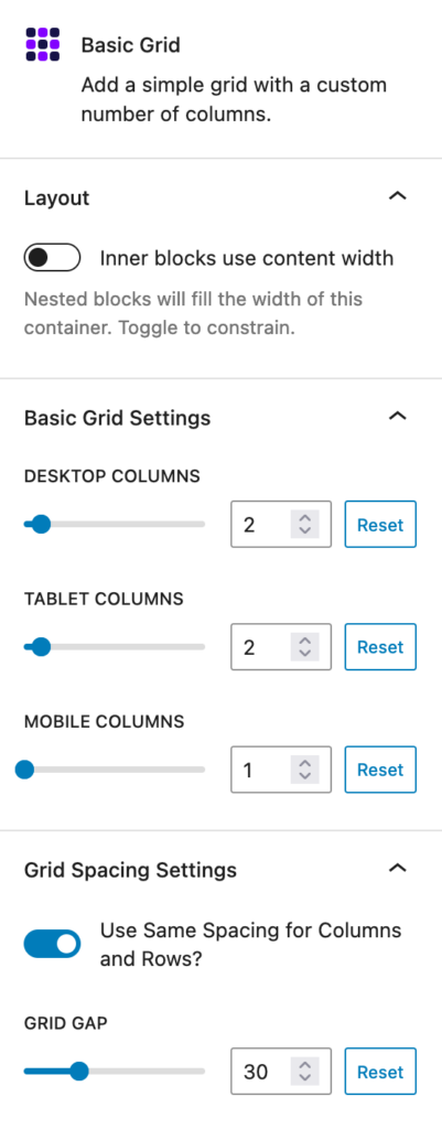
Once you’ve got the block added to the content, you’ll want to adjust the settings for the number of columns that are shown at various screen sizes. To do that, you’ll go over to the inspector controls on the right side of the page (if there is no right sidebar, you’ll want to click the “Settings” button in the right side of the top bar of the editor to get it to appear and make sure you’re in the “block” tab).
Here you can adjust the number of columns for desktop, tablet and mobile screen sizes. This way your grid will look good no matter what screen size a user is viewing your website on. You can choose between 1 and 12 columns for each screen size; however, as a personal rule, I wouldn’t use more than three columns for tablet sizes and no more than two columns for mobile sizes. But feel free to play around with it to see what works best for what you’re trying to create.
Also, you can set the amount of space between the grid items. You can choose to keep it even between rows and columns or set the row gap and column gap separately.
After you’ve set the number of columns as well as set the gap between items, it’s time to add in grid items to your grid. And this is pretty straightforward. To add in a grid item, make sure you’ve selected the Grid Block and click the plus icon in the editor. This will automatically add in a Grid Item Block with a group inner block. Then you can keep selecting that plus icon to add more grid items to the grid.
Adding blocks inside of the Grid Item Block is as simple as adding blocks to the content in general. Add in any blocks you need for that grid item and you’re good to go.
And now you’ve added a Grid Block to your content!
Advanced Grid Settings
While the Grid Block works perfectly fine if you follow the directions above, you can really take your grids to the next level with the advanced settings for each grid item.
To access these advanced settings, select a Grid Item Block in the content. Then in the Inspector Column, open up the “Advanced Grid Item Settings”.
Here you can choose how many columns and rows you want that grid item to span in the grid at the various screen sizes. So if you’re creating a photo gallery and you have your favorite image that you want featured, you can make it span multiple columns and rows so that it stands out from the crowd.
Finally, you can choose how items are spaced inside of the grid item: normal spacing, equal spacing between each of the inner blocks, aligning the items in the center vertically, aligning all of the items at the bottom or aligning just the last item at the bottom.
These tools help you take your grids from basic to stunning, and you don’t have to worry about any CSS or HTML!
Examples of what you can do
So now that you know how to use the Grid Block with the Crosswinds Blocks plugin, what can you build with the block?
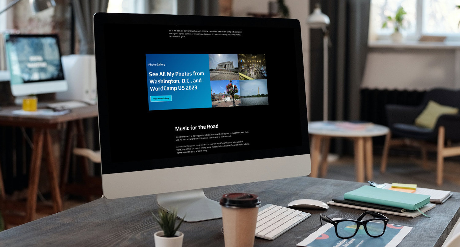
Well there’s always the tried and true photo gallery grid. With this block as well as the new feature in WordPress where you can allow a photo to be expanded when a user clicks on it, you can create a really cool photo gallery with varying widths and heights to showcase your great photos.
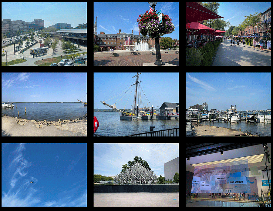
Also, you can create a grid of selected featured posts to highlight on your homepage, a landing page or any other page on your website.
If you have a portfolio website, you can also create a grid of your best portfolio projects that you want everyone to see.

And finally you can create amazing page layouts with varying widths and heights for different sections and make sure that they look great no matter what screen size they’re viewed on.

But really, the sky is the limit when it comes to just what you can create with the Grid Block!
Get the Crosswinds Blocks Plugin
Ready to get started creating amazing layouts on your pages? Want to add even more functionality to your website? Then it’s time to get the FREE Crosswinds Blocks plugin!
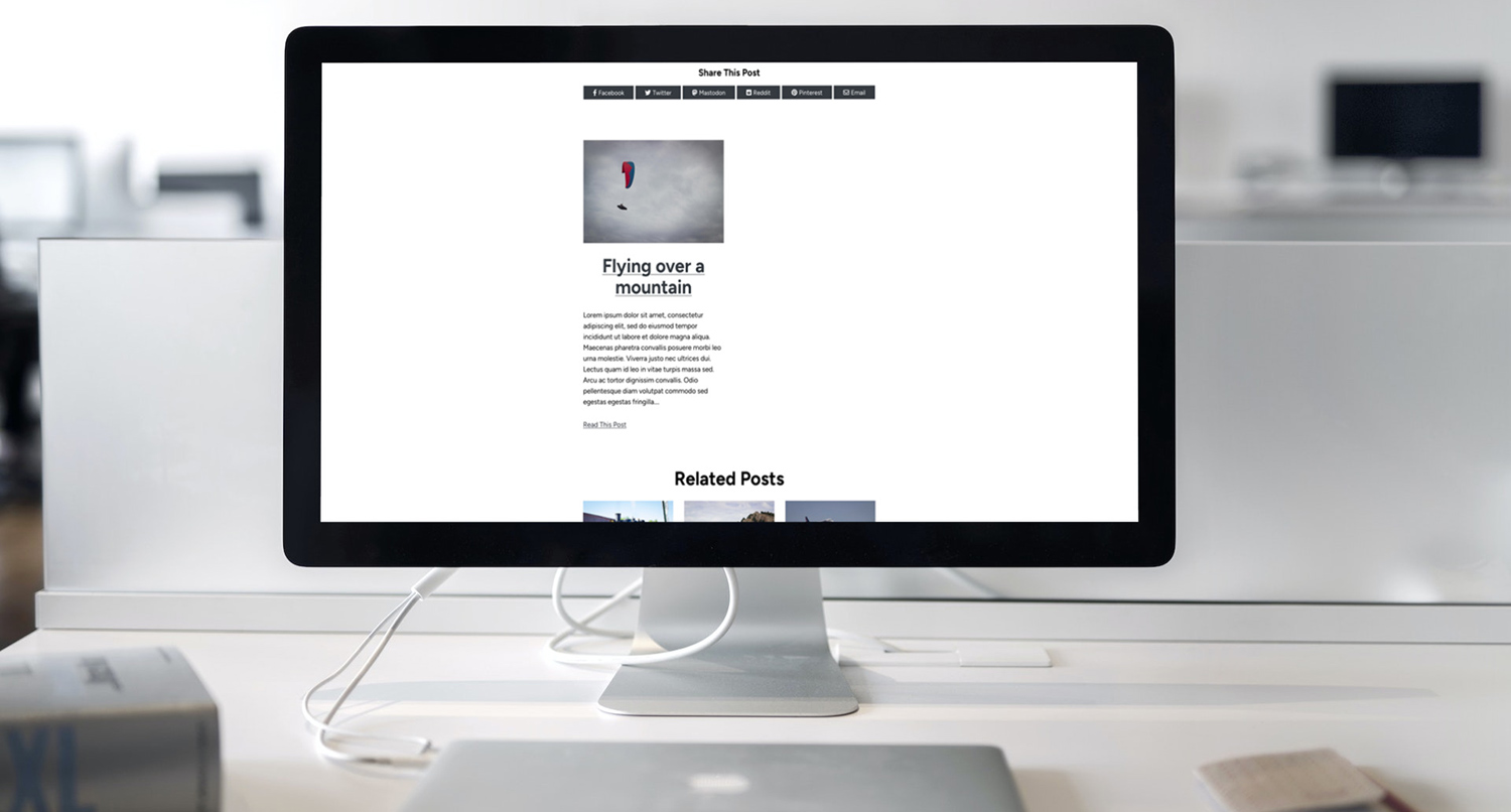
In addition to the grid block, you can also quickly add accordions and tabs. You can also spice up your single post templates with post navigation, related posts and social sharing sections. Or you can add breadcrumbs to your page headers, a copyright block to your footer and so much more.
It’s the perfect way to take your website to the next level no matter what theme you’re using!
Tags:




Crosswinds Blocks 1.1 Released Today